Note: this was written in 2021 (and updated in 2022) based on version 1 of the Oceanic+ app. In September 2023 version 2 of that app was released, and it appears to have fixed quite a few limitations (e.g. you can finally export your log book, as a standard UDDF file). Once I’ve gathered some real-world dive experience with the updated watch, I may write a new review.
A major reason I purchased an Apple Watch Ultra was for its loudly advertised ability to function as a dive computer, much like some Garmins.
It’s been a rough and disappointing road.
Right out of the gate, it didn’t work. It requires a 3rd-party application, Oceanic+, which didn’t exist at Apple Watch Ultra release time. It was over two months before Oceanic+ was finally released, on November 28th.
As it happens, my dive trip plans were delayed a bit anyway, resulting in my first dive [since purchasing the Apple Watch Ultra] being on that exact day. Hallelujah, I thought. I was able to hastily install the app in the morning, before leaving for a remote, internet-less island for a week.
But then there was the surprise that it basically requires an expensive subscription ($80/year, or even more if you commit to less than a whole year). Without it you don’t get tissue load and NDL tracking – critical functions of a dive computer. I was not aware before purchase, from any of the Apple Watch Ultra advertising or product pages on Apple’s website, that this subscription would be required. It feels surprisingly shifty and dishonest from a company like Apple.
Arguably the above frustrations (and costs) could be overlooked if it actually worked well. Unfortunately, it does not.
I discovered serious flaws with Oceanic+ right from the first dive. Flaws that any qualified diver would immediately recognise, which begs the question of why Apple & Oceanic+ somehow haven’t.
There are two major design flaws in its most basic function, the recording of dives:
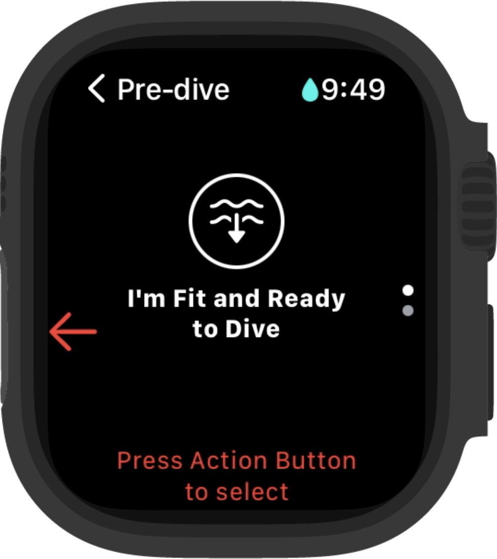
- It doesn’t start recording automatically.
You have to hit the “Action” button to acknowledge a lawyer-smelling disclaimer that you’re “fit to dive”. If you forget, it doesn’t record.
I’m not aware of any other dive computer that does this. e.g. my Shearwater Peregrine autodetects submersion below one metre even if it’s not on. It turns itself on and starts recording automatically. - If you ascend above one metre, even just for a split second, it immediately ends recording.
This makes shore entries, in particular, likely to go unrecorded (unless you’re able to swim out to deep water and descend rapidly, which isn’t always an option or the best dive plan). Descents in significant swell, currents, or surge could also fall victim to this design flaw.
So on my first dive I got five “dives” recorded, representing the four times where the swell floated me up to just above one metre (I never actually broke the surface). Even just reaching up momentarily with your watch hand, such as to grab a line or brush away a fin, could trigger it to fail.
Furthermore, there’s no way to merge these together in Oceanic+ – you can either keep them, messing up your dive counts and stats, or delete them, throwing away [parts of] actual dive records.
And on later dives I didn’t always notice it had failed and stopped recording, so it basically didn’t record the dive at all. This will be less of an issue if you’re using it as your only computer, since you’ll be looking at it periodically throughout your dive (I was using a separate dive computer as my primary, since I wisely didn’t trust the Apple Watch Ultra untested).
Again, I’m not aware of any other dive computer that has this flaw. e.g. my Peregrine allows a sixty second grace period before ending the dive (configurable for up to ten minutes).
These two combine to make it unsafe for diving. It might be better than nothing, or acceptable as a backup computer (as long as you’re religious about ensuring it’s recording all the time), but it’s arguably worse than no dive computer at all in that it provides a false sense of security – you might plan many dives in one day, relying on the Apple Watch Ultra to precisely track your tissue loading, but have it fail midway and leave you with a dangerous decision to make.
What makes this all the more frustrating is that there’s a lot of things to like about it otherwise:
- The Apple Watch Ultra screen is so much better than what you find on most dive watches – clear and readable, with relatively low glare, even in harsh daylight. Not to mention that it’s a touch screen, so [when dry, on the surface] it’s faster to change your settings, review your dive log, etc.
- The Apple Watch Ultra is a lot smaller than most dive computers. Even those that are nominally intended to dual-purpose as watches.
- The information display during diving is well-designed and user-friendly (certainly not as powerful as what you can get on other dive computers, but quite sufficient for basic recreational diving).
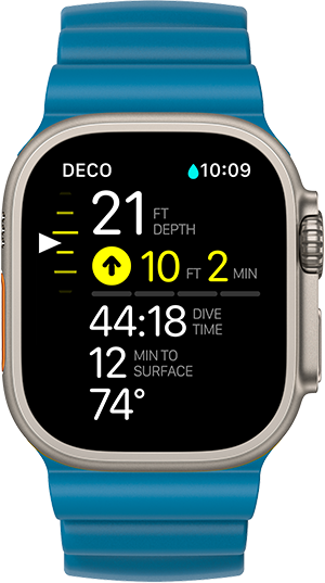
- The iPhone integration is smoother and easier than with other dive computers – dives appear on your phone automatically (albeit sometimes after a short delay).
- It records the geographic location of the dive, which many dive computers do not.
- Its configurable alerts – e.g. for depth, dive duration, etc – are nice and clear when they trigger underwater, with a clear and prominent visual display and strong vibration. I find that its alert vibration is much more likely to actually get my attention than that of my Peregrine.
It feels like it’s actually close to being a pretty good dive computer & companion app, if not for a handful of bizarrely obvious, serious flaws.
It feels, in fact, like it was very rushed – from the obviously daft design flaws noted above, to even just simple things like bad grammar, poor alignment, and broken layout in the GUI (it smells like they’re using SwiftUI and haven’t figure out how to work around all its layout problems). It seems they put more time into their slick website than their actual product.
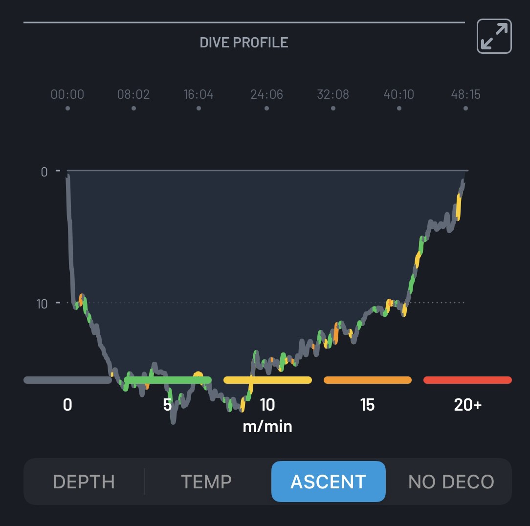

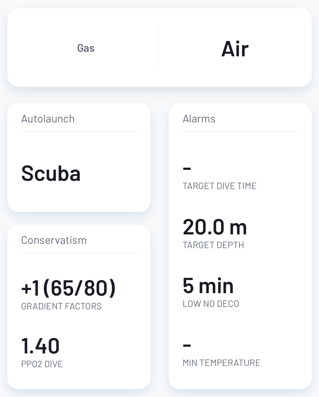
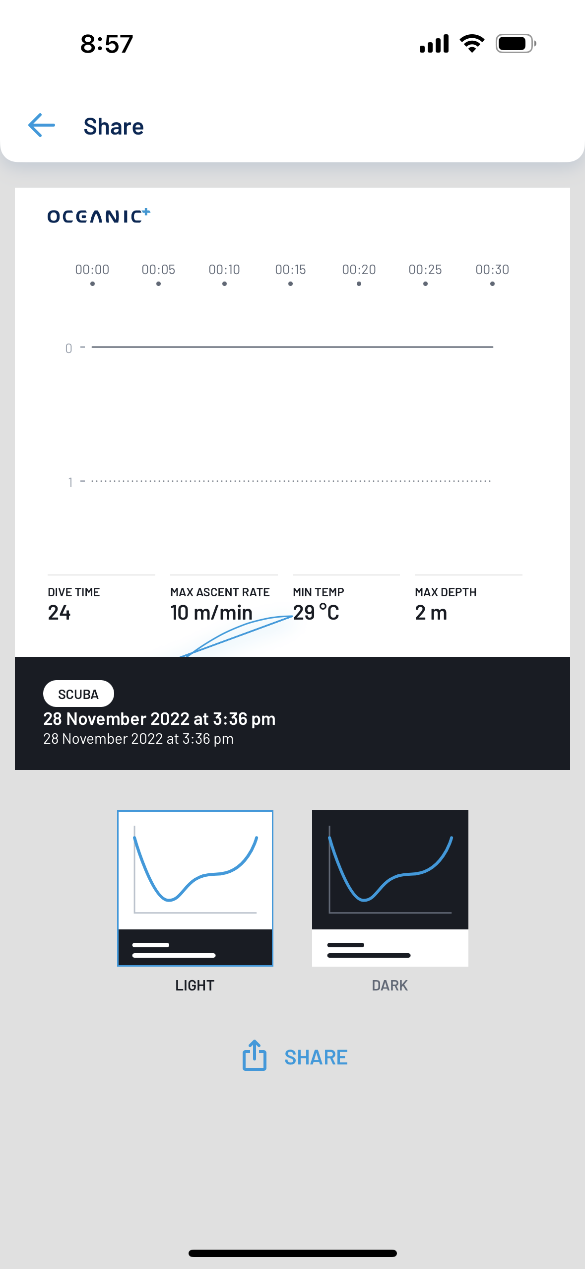
And of course there’s the other hint that maybe real-world testing was skipped – the fact that the iOS Oceanic+ app crashes on launch if you don’t have a good internet connection. On a boat, far from land? Or a remote island? Or in Airplane mode? Or just in an area with poor internet connectivity? No app for you. Crash on launch, every time. Forget about entering your dive details into the log while you actually remember them.
This remains the case even after six app updates over a month. Apparently Oceanic+ either don’t care that their app usually crashes on launch, or are incapable of fixing it.
Maybe there’s hope that in time they’ll be able to straighten all this out. But until then, I cannot in good conscience recommend the Apple Watch Ultra for diving. (it remains a fantastic watch for health-tracking and hiking, though)
For completeness, a list of other miscellaneous flaws and limitations:
- Any time you ascend past six metres, it throws up an alert about a safety stop. Which keeps buzzing at you forever, until you hit the action button. It’s hard to overstate how annoying this is when doing shallow dives. It is super distracting and may put you in harms way (e.g. if you’re constantly having to fiddle with the Apple Watch Ultra instead of paying attention to the reef around you).
I simply can’t fathom why they feel the need to alert for this at all. An alert would be warranted for skipping your safety stop, yet it doesn’t do that. - It vibrates the Apple Watch Ultra frequently without any indication why (nothing changes on the display). Observationally, I suspect it’s something to do with ascending “too fast”, but if so then it’s way too sensitive to small depth changes – it vibrates at me when simply ascending less than a metre (even when tens of metres deep, where a metre makes very little difference in pressure).
Overall, the Apple Watch Ultra is too chatty. It’s a classic boy-who-cried wolf problem waiting to happen. - It doesn’t show CNS, current PPO2, [surface] GF, etc. Especially when using enriched air (Nitrox), nearing no-decompression limits, or deep diving, these are important for safety. They are purely software features so it’s especially odd that they’re not included.
Surface GF is arguably the most important of these – it basically tells you how dangerous it is to surface immediately. When everything goes smoothly – and assuming you’re planning safe, conservative dives – you don’t need to worry much about it. But when things go awry it can be critical in helping you make the right decision under pressure. - There’s no Oceanic+ Mac app, or even a web version, which strongly discourages actually using Oceanic+ as your full dive log. Entering all the details of your dive – gear, notes, etc – is very tedious on an iPhone.
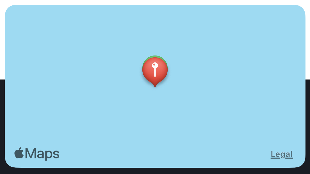
Some other dive computer manufacturers do have Mac apps (e.g. Shearwater, albeit one that’s clearly made in some janky cross-platform framework and looks like something you’d find in X11 in the 90s), and there are a few viable 3rd party options (e.g. MacDive, Subsurface). - The map it shows, of your entry & exit points, is useless most of the time, because it just shows as flat blue (for water) with no identifying geography. There’s no way to switch it to anything useful, like a satellite view that would actually reveal the reefs, sand bars, atolls, etc.
This is exacerbated by Apple Maps’ limitations. Google Maps, for example, often does show atolls & islands at least, and other surface features. Apple Maps simply lacks actual maps for most of the world’s oceans.
- The iOS Oceanic+ app lets you record what gear you were using, but bizarrely requires you to pick from a pre-defined list and that list is missing gear from major brands (e.g. Aqua Lung, Cressi). Another reason why it won’t be your real dive log.
- There’s no way to import or export dive data. This is both a lock-in concern – your dive data will be deleted if you end your subscription – and also a roadblock to using the Oceanic+ app as your real dive log, unless you have never and will never dive without an Apple Watch Ultra.
- You can’t change the activity type – dive vs snorkelling – underwater, nor after the fact. So if you forget to change it before going for a snorkel, you’ll forever have a bogus “dive” in your log (or you can delete the record entirely, but then you lose record of any free diving you do).
- There’s five entries in the main menu in the Oceanic+ watch app, which are arranged as a scrolling carousel… which is just weird and annoying since they’d fit all on one screen as simple buttons, which would make navigation much faster and easier.
- A lot of actions on the Oceanic+ watch app require more steps than seem necessary. e.g. changing numeric values requires not just selecting a different value but also tapping back to the previous screen (which also feels unnatural, like I’m backing out of the change without applying it). There are menus trees five or more levels deep, whereas it seems like they could be flattened into just two or three levels.
- Relatedly, you can’t edit any of your settings on your iPhone, only the watch. You can view the settings on the iPhone, which just makes it even more baffling why you can’t edit them there. Editing them on the watch is great in a pinch – you might not have your phone with you – but it’s a pain compared to on an iPhone.
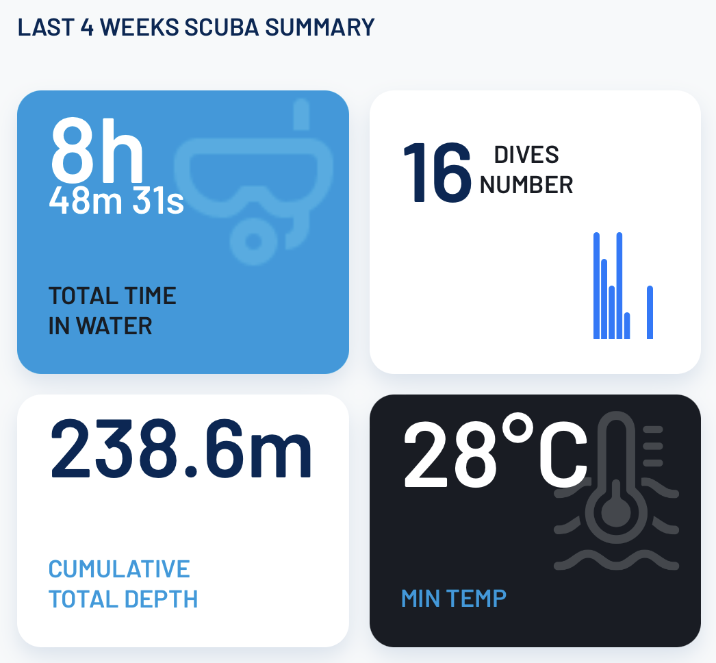
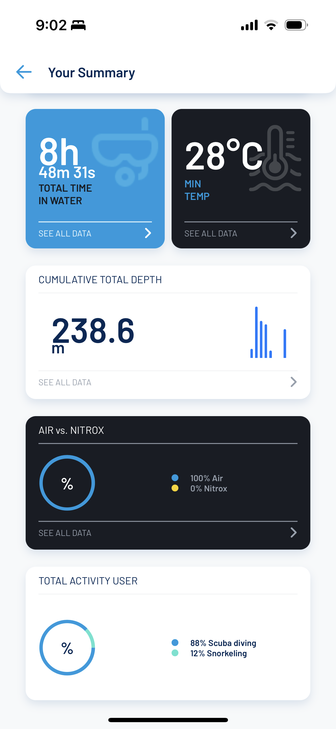
- The Oceanic+ iPhone app “Home” screen – what’s displayed when you launch the app – just shows a handful of stats of dubious merit. Minimum temperature over the last four weeks? Who cares. Cumulative total max depth? That clearly has no purpose. It seems like they knew they needed to show the most basic numbers – total dive count and duration – and felt compelled to stuff in a bunch more numbers for some reason. It’s also unclear why they think these are more important than your actual dive logs, or the dive planner.
- There’s supposedly seven watch complications available once you have Oceanic+ installed, but on my watch only two are available (“Max altitude” and “Oceanic Launcher”). This might be because I use a digital time display (the “Modular” face), something Apple seems to hate.
- The battery life is surprisingly short – about five hours of dive time. Given that the Apple Watch Ultra can record workarounds that are 16 hours long (at least – longer if you use energy-saving features), it’s a bit of a mystery to me why it chews through the battery so fast while diving. It’s not even monitoring your heart rate or other health metrics – just water pressure – and the screen brightness tends to be low since you’re underwater in low light.
Here’s a few things which are more just wishlist items (or: things you can get from some other dive computers, though you usually pay a lot more for those than you do an Apple Watch Ultra):
- Gas usage recording. Upmarket dive computers support wireless communication with a dongle that attaches to your first stage regulator. This means you can forgo a whole separate hose and dangly, annoying air gauge, and have a unified view of your dive status. It also means you get more accurate tracking of tissue loading, and more advanced functionality like gas consumption rates (great for extra safety – know if you’re going to run out of air too early – and for optimising your gas consumption over time).
Radio protocols like Bluetooth don’t work underwater – lower frequencies are required. So the Apple Watch Ultra would require an additional built-in antenna. It’s arguably reasonable to omit this in a watch that’s not intended solely for diving, given the cost or other trade-offs it might require.
That said, some air-integrated dive computers use sound instead of electromagnetism, and I suspect it’s not hard to support the necessary, inaudible frequencies in the Apple Watch Ultra’s microphone(s). Maybe this support is already present in hardware, and a transmitter dongle will be released later? - Multi-gas support. Most dive computers support this, even those that are much cheaper than an Apple Watch Ultra. This is arguably a more “serious” or “technical” feature, that most recreational divers won’t ever need, but it’s also easy to do – it’s purely a software feature.
- The ability to enter key dive details on the Apple Watch Ultra (as opposed to an iPhone), such as gas start & end pressures. It’s all too easy to forget these in-between the dive itself and when you get back to land and your iPhone.
- The dive planner functionality is pretty rudimentary. e.g. you can’t do anything like actually enter a dive depth profile (whether as a squiggle with your finger, to give the rough idea, or importing it from a previous dive at the same site). The GUI is also a bit obtuse, especially in the Oceanic+ iOS app, as rather than showing a simple table or chart of depth vs no-deco times it makes you pick a single depth and gives you a single no-deco time. For planning you often want to consider multiple depth options and pick the right trade-off against dive (or at least bottom) duration.
- It might actually be nice to have some “social” functionality. Not for bragging and other vanity purposes – I’m not talking about inane integrations with Facebook or whatever – but for sharing amongst dive buddies and the like. I suspect there’s some neat, innovative possibilities here (e.g. automatically detect physically- & temporally-nearby dive friends, and be able to automagically see their photos & notes on what they saw on what’s presumably the same dive with you – maybe even add your own notes on theirs like “don’t forget about that Whale Shark eating that Orca!”).
And lastly just some miscellanea:
- Apple / Oceanic say that it won’t record below forty metres, but it does. Thankfully – the last thing you want if you do a deep dive, intentionally or especially unintentionally, is for your dive computer to not record your dive profile correctly.
I don’t regret getting my Apple Watch Ultra – it’s proven a worthwhile upgrade even just for its other features like battery life and a relatively large screen – but I am sad that I can’t actually rely on it for diving. And that I had to spend a lot of extra money to get a dive computer – the Peregrine – that I can rely on.
For reference, I’ve completed about fifty dives with the Apple Watch Ultra.
Addendum (May 2023)
I’ve now had the Apple Watch Ultra accompany me on about 150 dives. Sadly, despite it being a long six months later, little has changed. The Oceanic+ app is still awkward and very rudimentary, with the same data and platform lock-in problems. The Apple Watch component is almost unchanged – same limitations and GUI frustrations.
Two things which did improve at some point:
- Recording now happens when submerged even if you haven’t clicked through the lawyer screen. This is a significant safety improvement.
However, if you go the entire dive and return to the surface without clicking through the lawyer screen, the recording is discarded. So there’s still danger here. You just get (a lot) more time to realise the watch is being obstinate (and you really should be looking at your Apple Watch Ultra at least once during the whole dive anyway, even if it’s just your backup, to ensure it’s working and to check its data against your primary). - The Oceanic+ app seems to have fixed many of the glaring GUI bugs – e.g. the charts that rendered in the wrong places on the screen (or not at all), inconsistent font sizes and baselines, etc.
I haven’t systematically re-reviewed the Oceanic+ app, so perhaps there’s been additional fixes or improvements too. I’ve barely used it since my initial review, since I can only rely on my primary dive computer (Shearwater Peregrine) anyway. For what it’s worth, I use MacDive on my iPhone & Mac and am reasonably happy with it.
I wish I’d just bought the Shearwater Teric, though – the Peregrine was me hedging my bets and hoping that the Apple Watch Ultra would prove sufficient alone. The Peregrine is good but the Teric is much nicer (and for clear reason by far the most popular dive computer on the six boats I’ve dived from).

Agree with your Apple Watch Ultra review. I’ve dived with it for 3 weeks total. 1 week in December and recently (May) 2 weeks in the Cayman Islands. In December it worked. It failed as a life support system on this last trip when the depth sensor was not functioning. Kinda important in a dive computer. Depth seemed to be a random number generator. It decided I was diving in the shower in my room, gave me an ascent warning, then started a safety stop, and then locked me out for 48 hours for violating ascent parameters and not completing my safety stop. All while in the shower in my room! Luckily it was not my primary computer and the dive op didn’t wait for the lock out to clear before I could dive again.
And the cherry on top of this is that in spite of it still being under warranty, if I didn’t have Apple Care on it, it would have cost $499 to repair. More than half the purchase price of the Watch. The Apple folks did not seem a bit concerned that for a diver, this is type of failure could cause serious injury.
In my opinion, using this as a primary dive computer is dangerous. If you are looking for a backup, there are many reputable manufacturers who stand by their products and produce less expensive dive computers. In over 30 years of diving, I’ve never experienced such a basic failure in a dive computer.
That sucks – I’m sorry you had so much trouble with yours. Very odd that a mere shower would be enough to break its depth sensor… hopefully that was a random manufacturing flaw and your fixed / replaced watch isn’t susceptible to it.
I guess it’s good that I usually charge mine while I’m in the shower. Maybe that’s saved me from a trip to the Apple Store? 🤔
thank you for the article