Prelude
For better or worse, Aperture is dying. Abandoned by Apple many years ago now, it’s frankly amazing it hasn’t completely broken already, given the steady stream of system updates and such changes since then. Regardless, it has always had rough edges, and on top of all that I’ve grown increasingly disappointed with its image quality – both fundamental raw rendering as well as with editing. So, I need an alternative.
Staggeringly, there’s still nothing else out there quite like Aperture. Lightroom is probably the closest, but it has a lot of design flaws – particularly in its UI – and, from what I hear, perpetual & unpredictable performance issues (not that Aperture is great there either). But it is undoubtably the de facto standard, and has vastly more community – providing tutorials, presets, plug-ins, etc – which is also valuable.
There’s DxO Optics. I’ve played with it before and know that it can do an amazingly better job than Aperture (w.r.t. image quality). It’s a relatively bare-bones program, however, with minimal editing capabilities and not even the pretense of actual image management.
There’s also Capture One, which while undoubtedly the most expensive option out there today, also has a reputation for being the best w.r.t. image quality. It’s also been around longer than any of these other options. It has a reasonable set of editing capabilities. It sort of tries to do image management, though it’s clear it’s not trying very hard, and it has some pretty serious UI issues and bugs in this area.
I spent quite some time playing with each of these three alternatives, trying to develop a broad feel for their respective strengths and weaknesses. What I found is that they all require compromises compared to what I’m used to from Aperture, and it’s really a Sophie’s choice of which things I’ll miss least. That’s not a fun choice to have to make.
So I had to ask myself what really matters. I find myself thinking that I should choose first and foremost based on image quality, on the basis that I spend a ridiculous amount of money on all the other gear necessary to take a quality photographs to begin with, and inordinate amounts of my own time in managing and editing photos – the end result of which is ultimately judged almost solely by the quality of the images that I publish online & print. And for ancillary features like Flickr export and whatnot, there are other workflow options, even if it’s a few more steps to utilise them.
Thus, this comparison.
I’m presenting this in something of a reverse order, on the assumption that most readers will just want to cut to the chase and see what my findings & advice are. But I do want to also detail my methodology, so that others can understand and reproduce it – so that’s included at the end.
Note: yes, there’s also Apple’s Photos, which is just iPhoto’s younger, hipster sibling. It’s essentially DxO Optics’ inverse – a decent image management app with very rudimentary image editing capabilities. And it shares Aperture’s raw rendering engine, which I already feel to be decidedly mediocre. While there are hypothetical options involving things like the DxO Optics plug-in for Photos, along with a small army of not-entirely-existent-yet plug-ins for actual image editing, I’m defaulting that to the very last resort. Plus it’ll probably be abandoned within a couple of years anyway – as is Apple’s inevitable wont.
Though for the purposes of this comparison – of just the raw rendering engines – I expect Aperture’s results to be equivalent to Photos’.
Conclusion
TL;DR: Capture One wins by a safe margin, no matter how you look at it.
Specifically, here’s the overall ranking per photo:
| Photo | Aperture 3.6 | Capture One 9 Pro | DxO Optics 10 | Lightroom 2015.3 |
|---|---|---|---|---|
| The Lake | 2 | 1 | 4 | 2 |
| The Ceiling | 2 | 3 | 4 | 1 |
| The Peacock | 4 | 1 | 2 | 3 |
| The Cat | 2 | 1 | 4 | 2 |
| The Deer | 2 | 1 | 2 | 2 |
| The Harrier | 4 | 1 | 2 | 3 |
| The Gopher | 2 | 1 | 1 | 4 |
| The Granite | 3 | 2 | 1 | 4 |
| The Sunrise | 2 | 2 | 1 | 2 |
| The Valley | 3 | 1 | 2 | 3 |
That’s seven 1st-place results for Capture One, vs three for DxO Optics, one for Lightroom, and zero for Aperture.
Or, looked at another way, the rankings by average position:
- Capture One (1.4)
- DxO Optics (2.3)
- Aperture & Lightroom (2.6)
In short:
- Capture One almost always rendered the most fine detail, while simultaneously almost always rendering the least noise. Its renditions were often lacking contrast, however, and – with a couple of notable exceptions – its colour rendition was relatively muted.
- DxO Optics was often similarly sharp to Capture One – and sometimes moreso – though it achieved its results less elegantly, with an often ‘over-processed’ look and blotchy noise reduction. It was the only raw converter which corrected geometric distortion, which may have penalised it w.r.t. sharpness, which I gave more weight to.
- Aperture & Lightroom often rendered very similar results, which had (typically) significantly less fine detail than the other two renderers, and often produced relatively accurate but aesthetically disinteresting colours and contrast.
- Lightroom favours significantly greater sharpening by default, than Aperture, and this also manifests as dramatically more noise in some cases.
- Lightroom also tended to err on the side of over-exposure, whereas Aperture was a bit more accurate generally, but occasionally under-exposed.
A few things surprised me in these results, though one above all others: that Lightroom doesn’t actually do a particularly good job of rendering raws. This is really unexpected to me because Lightroom / Adobe Camera Raw is by far the most common raw renderer out there, and has plenty of praise spoken about it. As the closest approximation to Aperture as an actual image manager and editor, I was secretly hoping it would perform well so that I could choose it, other aversions be damned. Alas, no such luck.
I was also surprised at the performance of DxO Optics – I own an older copy, version 8, and have used it from time to time. I’ve found it particularly useful – compared to Aperture – for high ISO images, where it does a much better job, at times, in minimising noise and bringing out shadow detail. But that might be the explanation – the test performed here judged only the initial raw rendering, not key edits like dramatic exposure adjustments (including highlight & shadow recovery). I strongly suspect DxO Optics would distinguish itself much more from Aperture in editing tests.
I will also add that Capture One’s results, when heavily scrutinised, sometimes felt contrary to my previous anecdotal experience with it. When toggling between Aperture and Capture One I’d previously seen a huge image quality improvement all round. Make no mistake – there is a big difference shown in this test. But my prior dabbles with it had, at the time, seemed more dramatic still. Its possible the few images I’d compared previously were especially favourable to Capture One. Or that, once you actually apply some meaningful edits, that Capture One’s advantage over Aperture only increases. I suspect that is in fact the case, much as I suspect the same for DxO Optics, but again image editing was not tested here.
Results
How to interpret these results
The methodology section, at the end, fully details how these images were processed in each of the contenders, and prepared for web presentation. Suffice then, for now, to say that:
- I chose ten images that are deliberately not perfect but reflect a reasonable cross-section of my whole photo collection. I did make some effort to include specific technical scenarios (e.g. high ISO), that not much – my primary focus was on a representative set of images, not a technically diverse one.
- My fundamental test is of how well each of the contending programs presents the raws straight out of the camera. Nothing more. Don’t complain. Maybe I’ll test other aspects later, and you’re certainly welcome to yourself – add a comment at the end with a link to your tests. But keep in mind the very specific scope here.
- For each of the sample images, I’m using two views:
- A full view of the photo, to gauge general colour rendition, exposure, etc.
- A 100% crop clipping from a key part of the image, to really investigate acuity, contrast, and noise.
Keep in mind that if your browser window is narrow (e.g. you’re on a mobile device) you may be seeing a low-resolution view – for best results, ensure your browser window is wide enough to see the images at full size.
The actual results
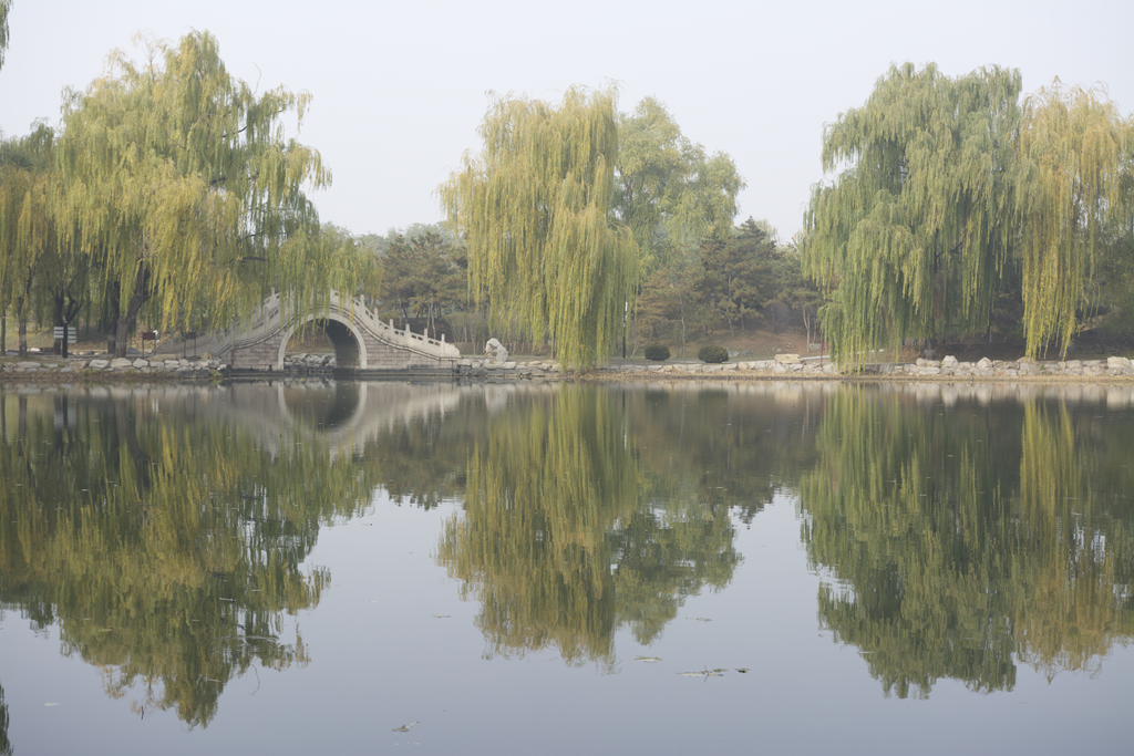
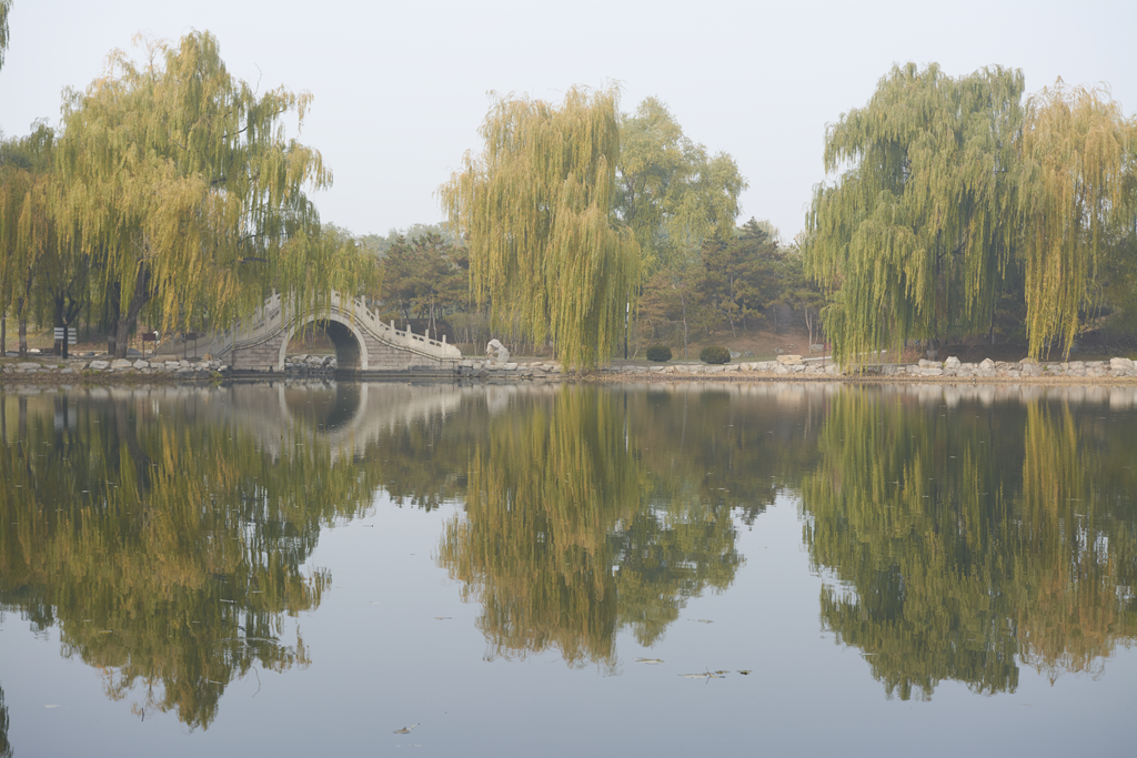
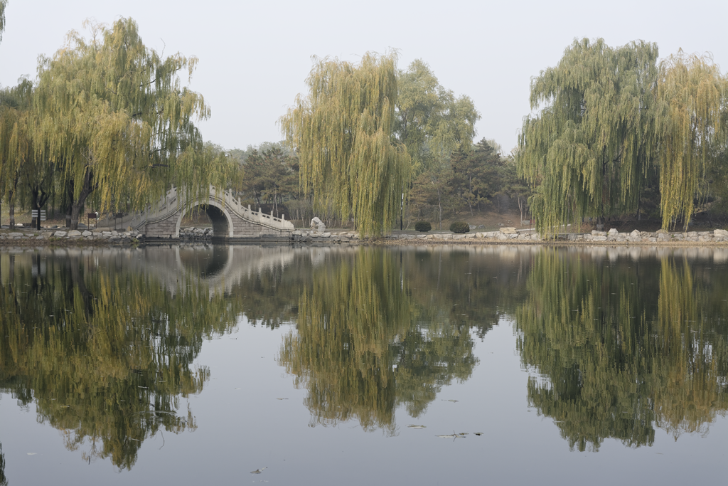
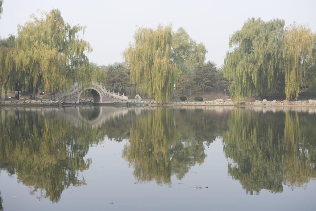
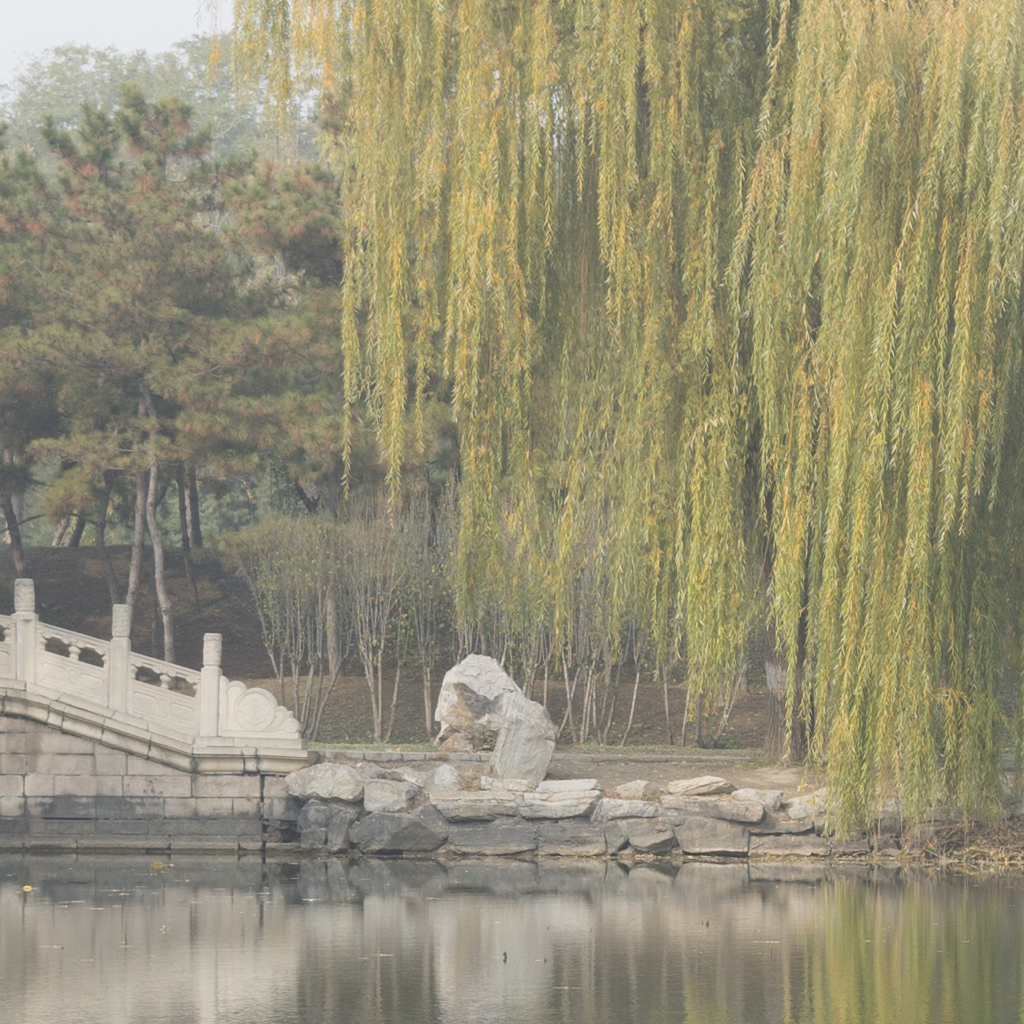
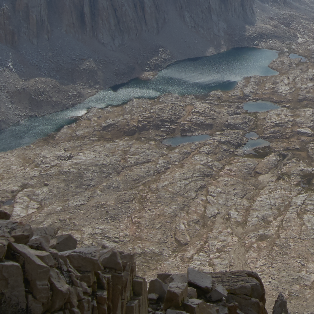
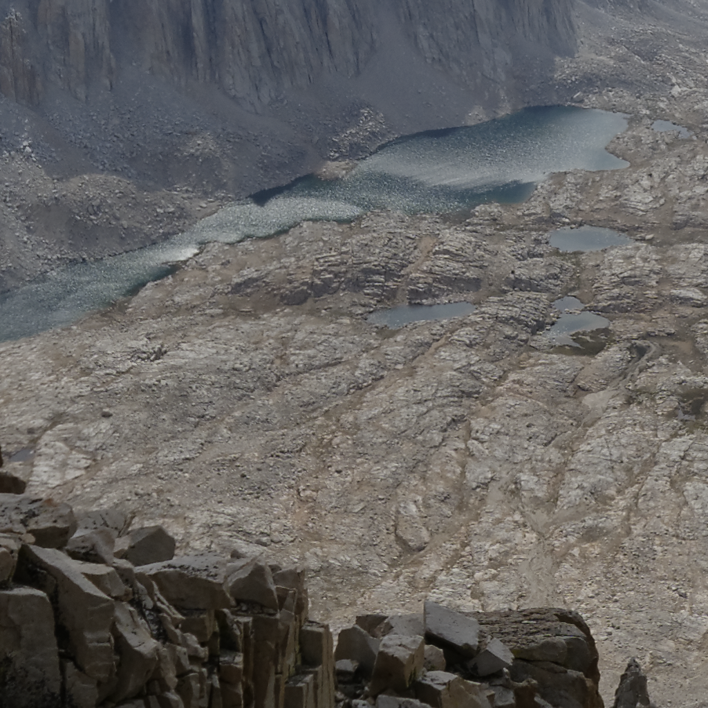
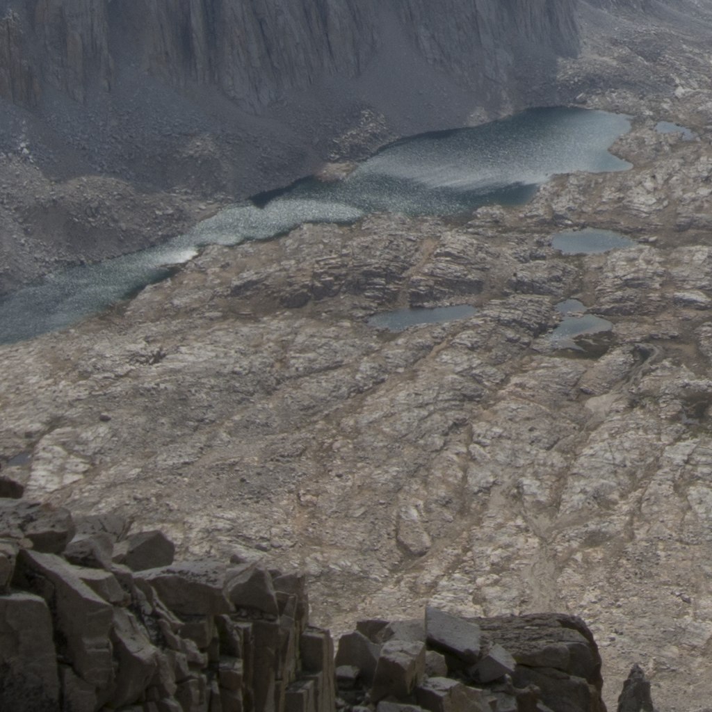
The Lake
This first image is a random, flat landscape shot. It was a slightly foggy day when this was taken, with overcast skies and little wind. Cold, also – not much above freezing.
Aperture & Lightroom both render this one truer to how I actually remember the scene being – i.e. genuinely flat & dull. It’s surprising how similar they are to each other, though Lightroom’s rendition is the dullest.
Capture One has gone with a naturally vibrant look, which I find quite pleasing, even if it is technically inaccurate. It’s also clearly more detailed [than Aperture or Lightroom’s] even at this reduced viewing size.
DxO Optics is the outlier here, with a surprising, somewhat grungy look. Far contrastier than the other three, and appearing to my eye perhaps a little over-sharpened. That said, colour-wise it’s actually not that inaccurate.
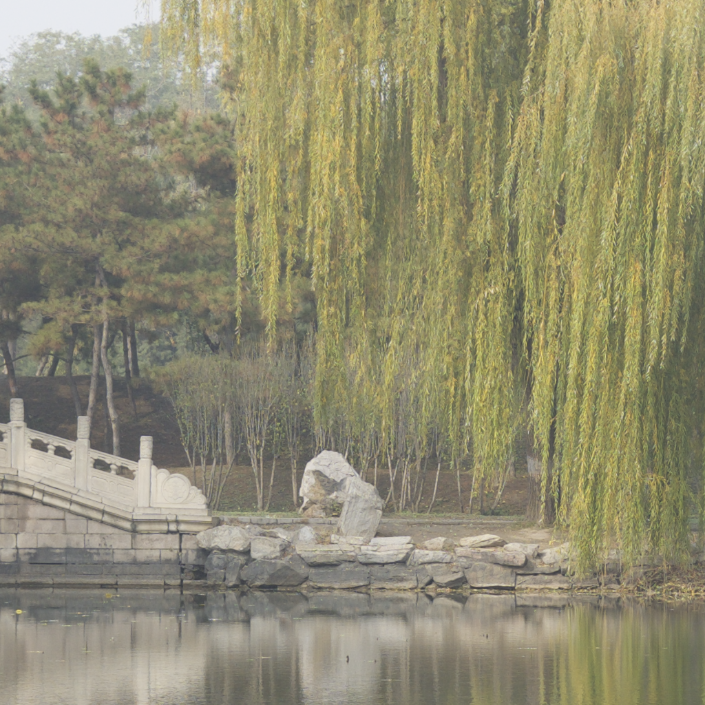
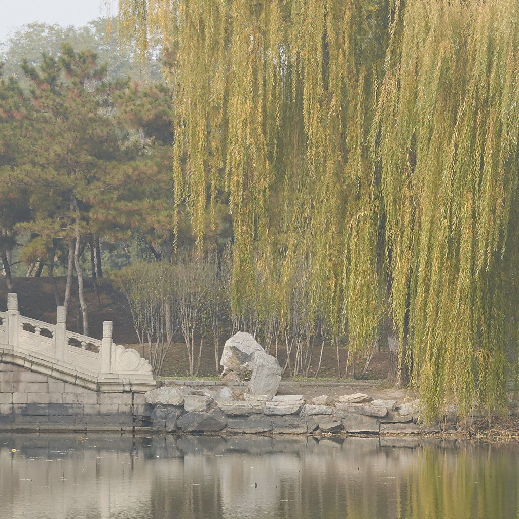
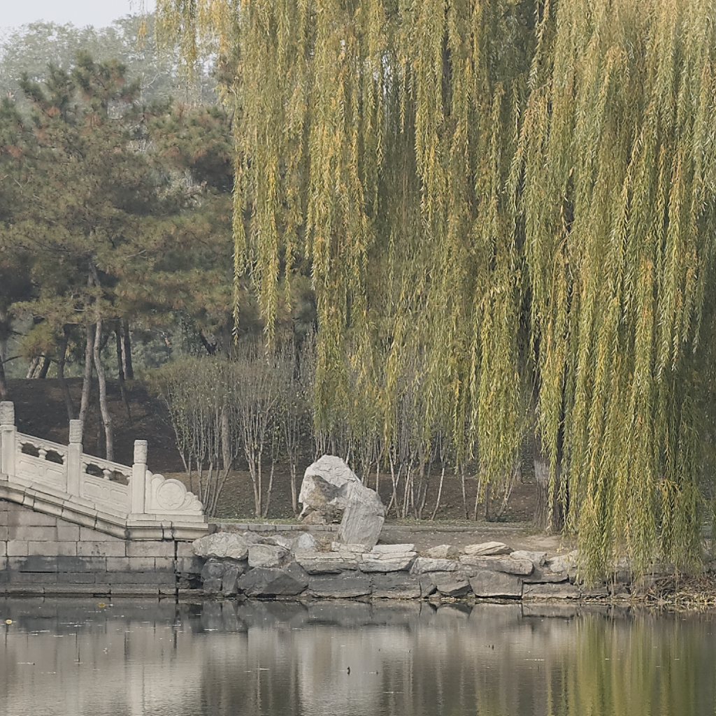
This 100% view just confirms what was already somewhat visible when zoomed out – that Capture One & DxO Optics are rendering much more detail. I find Capture One’s rendition more natural and pleasing, but I could see some people favouring DxO Optics’.
In any case, though, they both do a much better job than Aperture or Lightroom.
What really surprises me here is how uncompetitive Lightroom is. Its rendition has barely any more detail than Aperture’s, which I find very surprising given how popular Lightroom (and Adobe Camera Raw) are. Nonetheless, it still is that tiny bit sharper than Aperture’s.
Judgement
I firmly prefer the Capture One version – it just looks better to me, plain and simple. Capture One really brings out a lot of genuine detail, without any artifacting that I can see, and without looking over-processed (to my eye).
I respect Aperture & Lightroom for their ‘honest’ rendition of the scene, but would undoubtedly – were I to fully post-process this image in them – try to make them look more like Capture One’s version. And their lack of detail is very disappointing.
Note: the obvious question is whether you can dig out that same detail, that Capture One has by default, from Aperture or Lightroom. That’s difficult to answer conclusively, since there are many possible approaches with many possible fine-tuning settings.
I have extensive experience with Aperture (many years and thousands of images processed), and I am confident that I cannot get as good an image out of it, as Capture One or DxO Optics are giving by default. It simply doesn’t have the detail there in its original raw rendering.
I do not have much experience with Lightroom. I did do some quick experimentation with it, and was able to get fairly close to Capture One’s acuity, but not without introducing visible sharpening artefacts, never with quite the same really fine detail, and not without a lot of time & effort. It was nonetheless a bit more capable than Aperture in this respect, though.
And DxO Optics… overall I’m inclined to rank it below the other three, but that’s mainly on the basis that its exaggerated contrast, sharpening, and structure just don’t suite this scene. But I do feel that, if I were going to put some time into editing, then DxO Optics offers a much better starting position than Aperture or Lightroom – because, again, it has much more genuine detail available to start with.
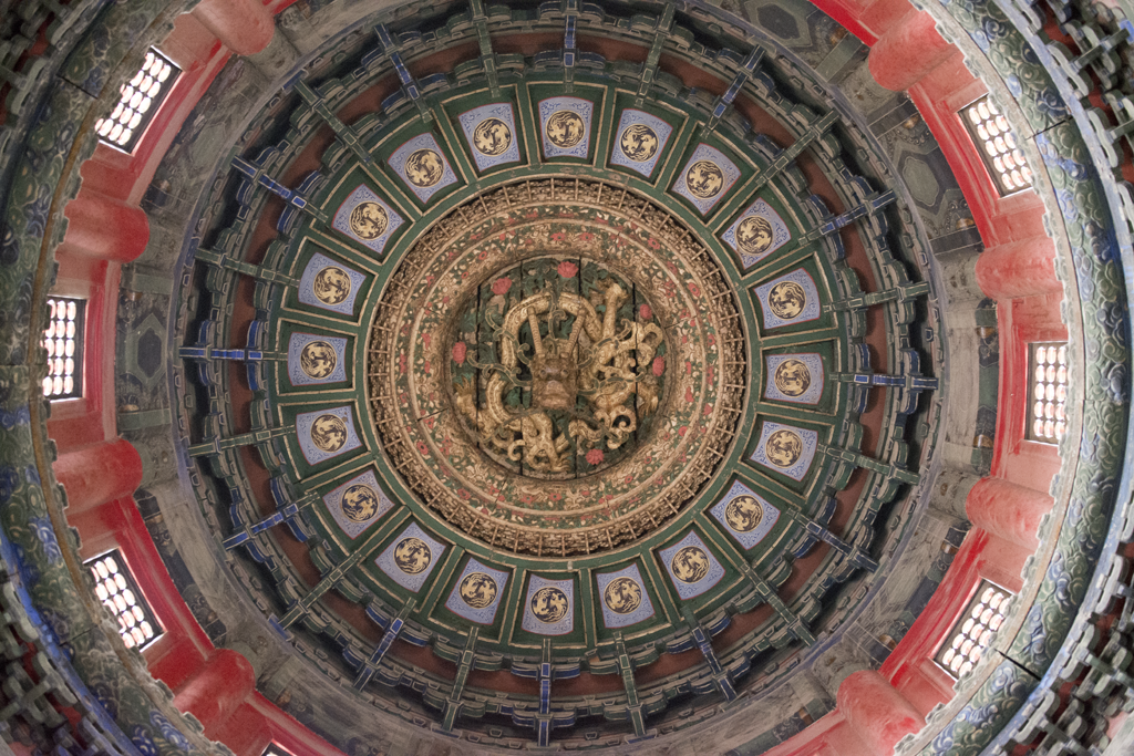
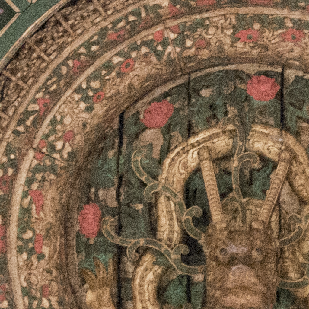
The Ceiling
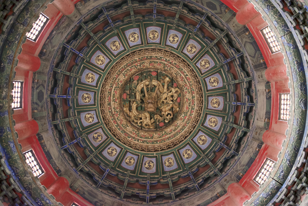
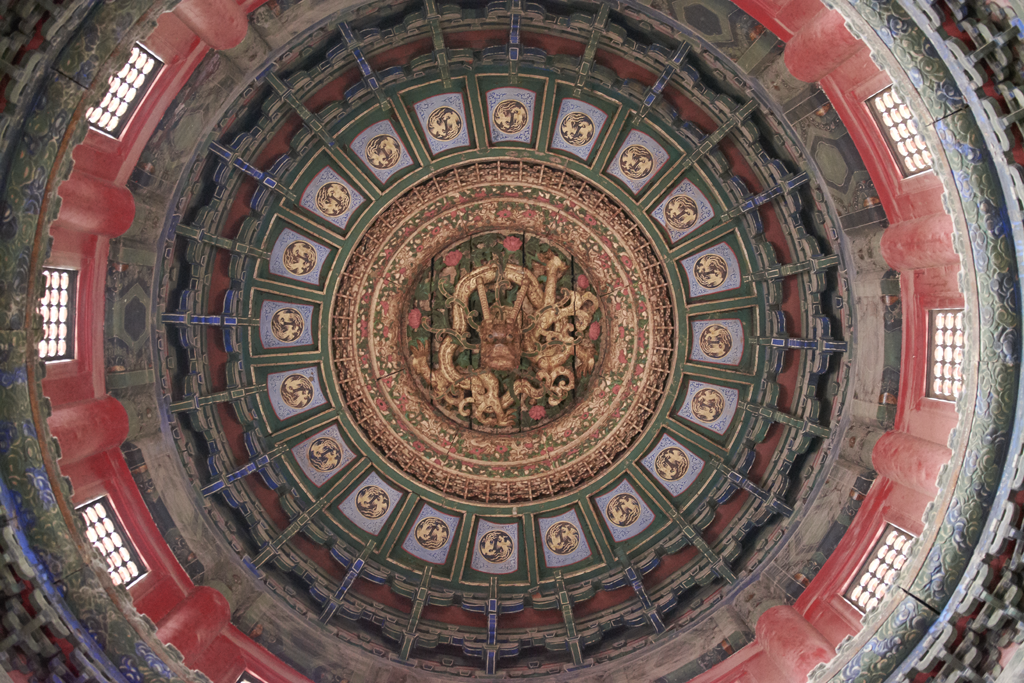
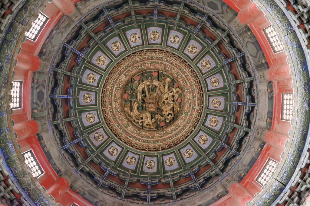
This one is intended to represent a common low-light scenario – a high ISO, plus a bit of motion blur due to hand-holding at slow shutter speeds (1/10s in this case, without VR).
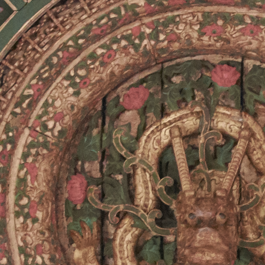
I actually like Aperture’s colour rendition in this case. It’s getting close to over-exaggerated, particularly with the reds, but otherwise its solid saturation is pleasing to me. Lightroom’s rendition is similar to me, though ever so slightly sharper and with higher local contrast.
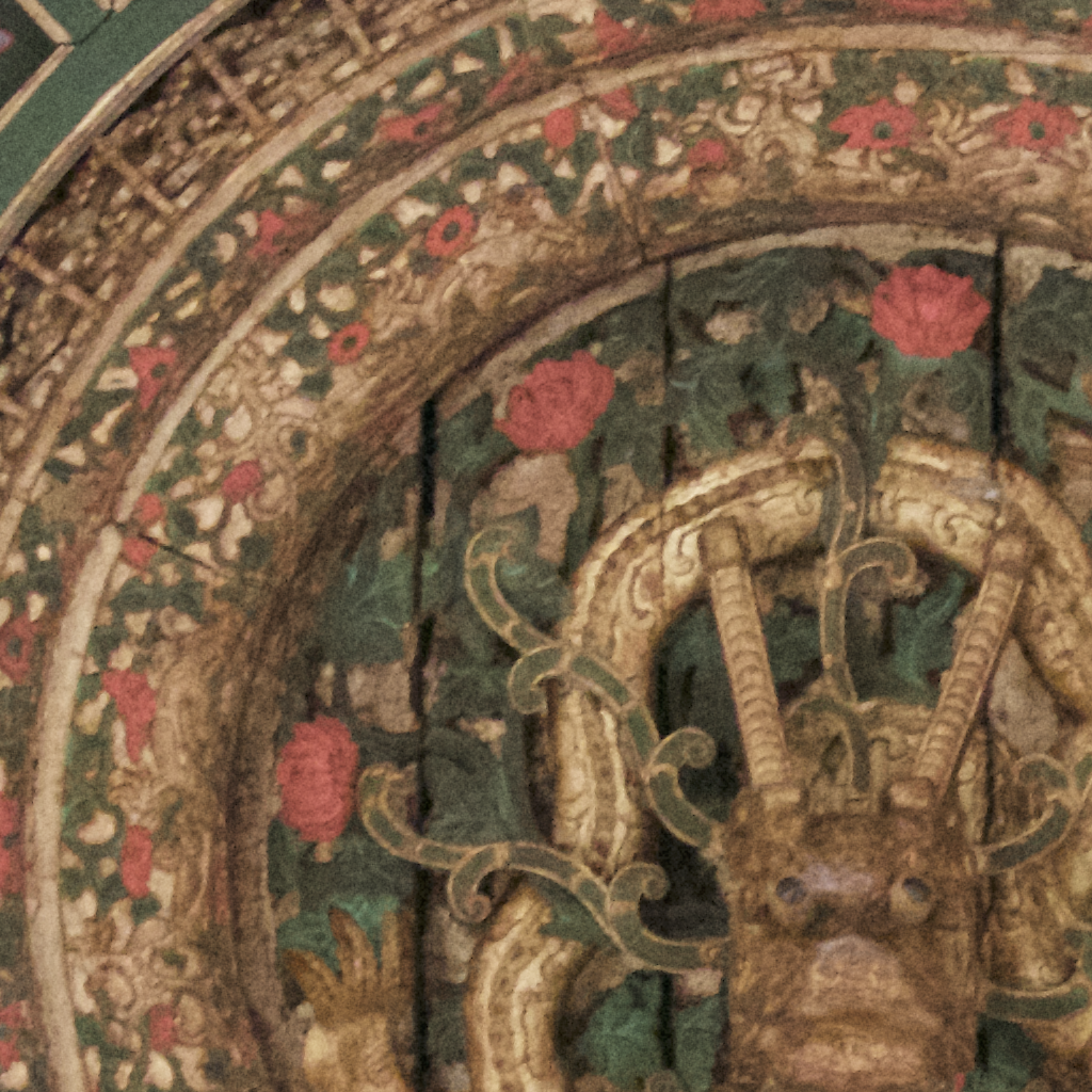
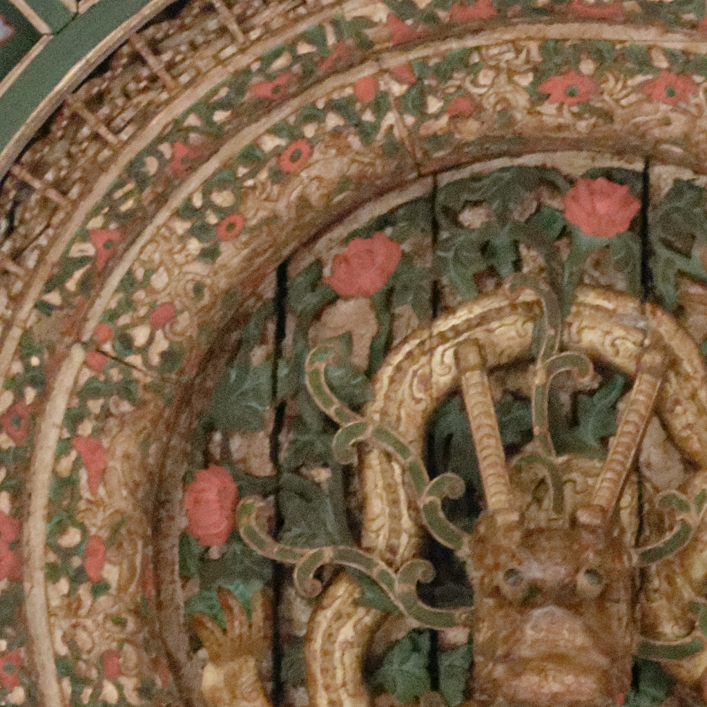
Capture One’s rendition disappoints me this time around. The muted colours and lower contrast do it no favours, producing an appearance of lesser detail than Aperture or Lightroom, even though objectively it renders slightly higher detail.
DxO Optics has given the whole image a bit of a red cast, for some reason, and the red walls around the sides are tending towards radioactive. However, it’s also the only one of the four which actually corrected for the lens’ geometric distortion. The effect is basically foiled in this case, though, by the circular and symmetrical subject. And is perhaps contributing to its lack of sharpness – surprisingly, given the results from the previous photo, DxO Optics’ rendition has the least detail this time around.
The standout here is Lightroom. For good and for bad. It has appeared to render more detail than the others (with Aperture a not distant second), but this is quite possibly something of an optical illusion performed by it’s dramatically higher noise levels. If you look closely, you’ll be hard pressed to find anywhere with genuinely greater fine detail, compared to Capture One’s or even Aperture’s rendition. Just a lot of crude over-sharpening.
DxO Optics, on the other hand, has gone entirely the other direction – rendering slightly less noise than the other three, but also significantly less detail. Possibly its geometric distortion correction has contributed negatively here. Its rendition is very ‘painterly’ to my eyes, which I do not like at all.
Capture One has rendered more detail than Aperture, and some is genuinely new detail, though otherwise it looks mostly like a simple difference in sharpening defaults.
Judgement
This one surprised me. While objectively Capture One renders detail the best, at the smaller view size I find I actually prefer Lightroom and Aperture’s renditions. While I’m leery of the significant noise in Lightroom’s rendition, I personally like to err on the side of detail – and could always choose to carefully noise reduce, which looking at these images I suspect I could do better than the other three are doing with their default settings, and thus maintaining a margin of extra detail.
That said, Capture One’s only real negative is its flatter, less colourful initial rendition, which might be as simple to ‘fix’ as a quick contrast & saturation adjustment.
DxO Optics is the loser in this round, though, due to its clear lack of fine detail. It’s possible it’d be helped by turning off its geometric distortion correction, but I did not test that.
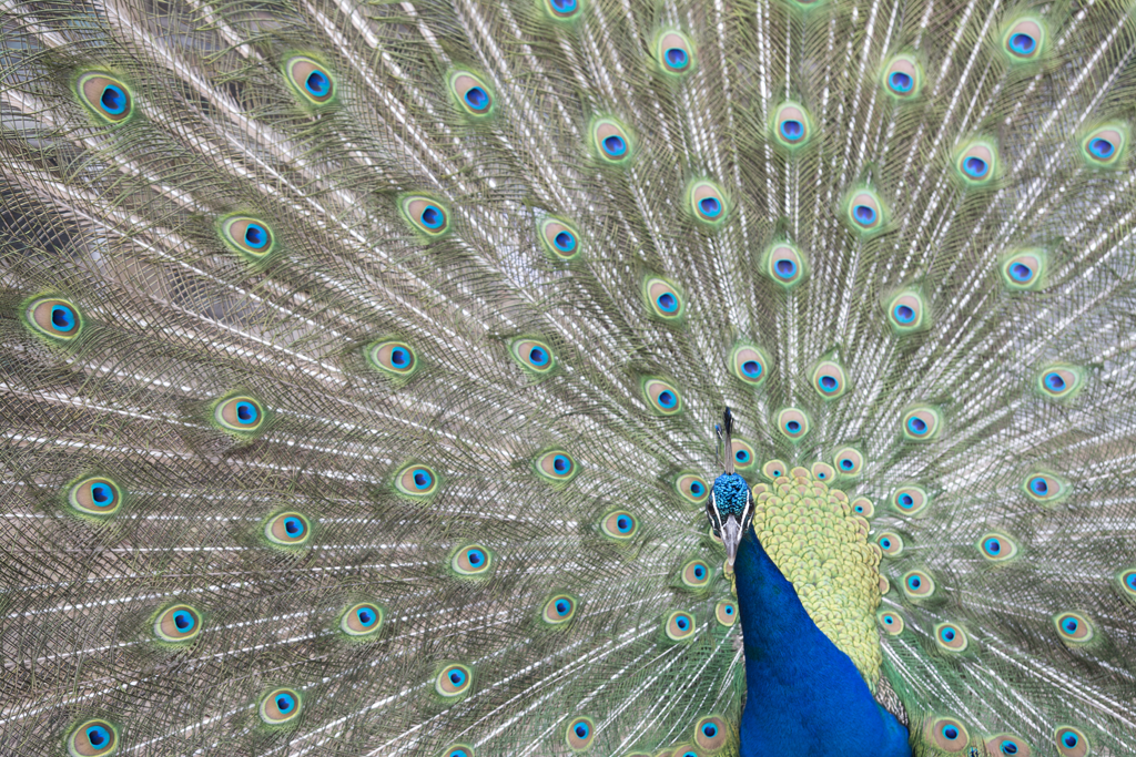
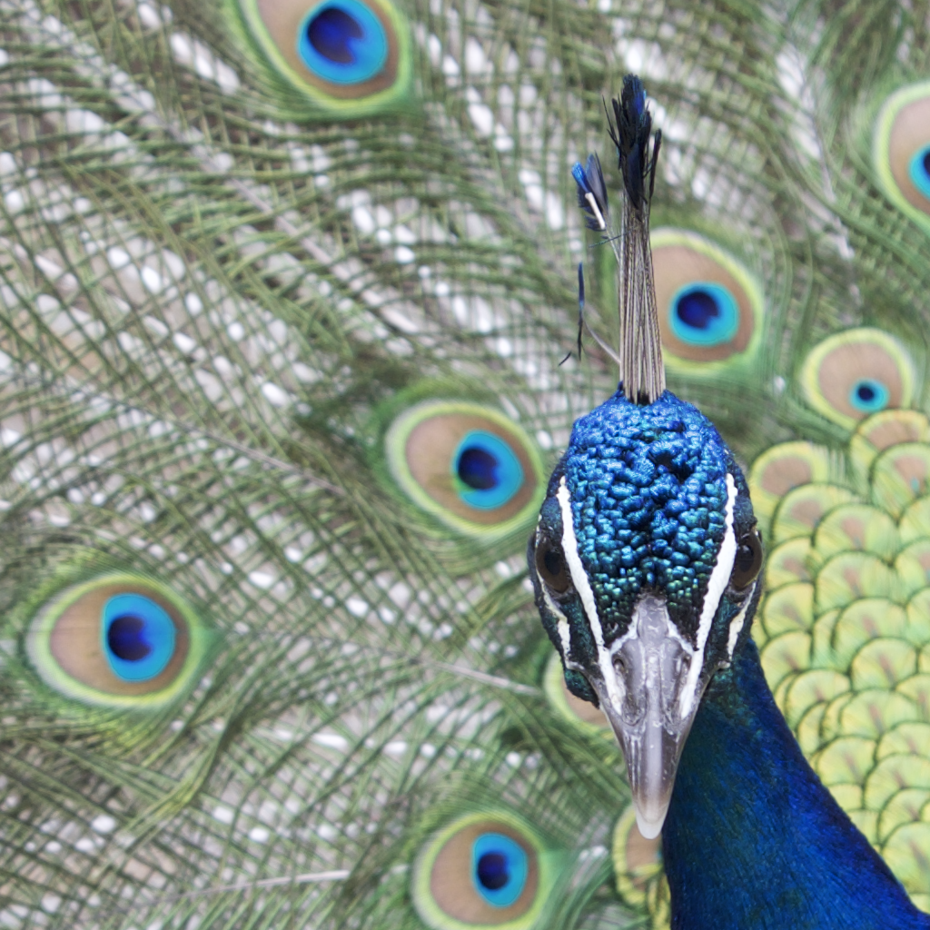
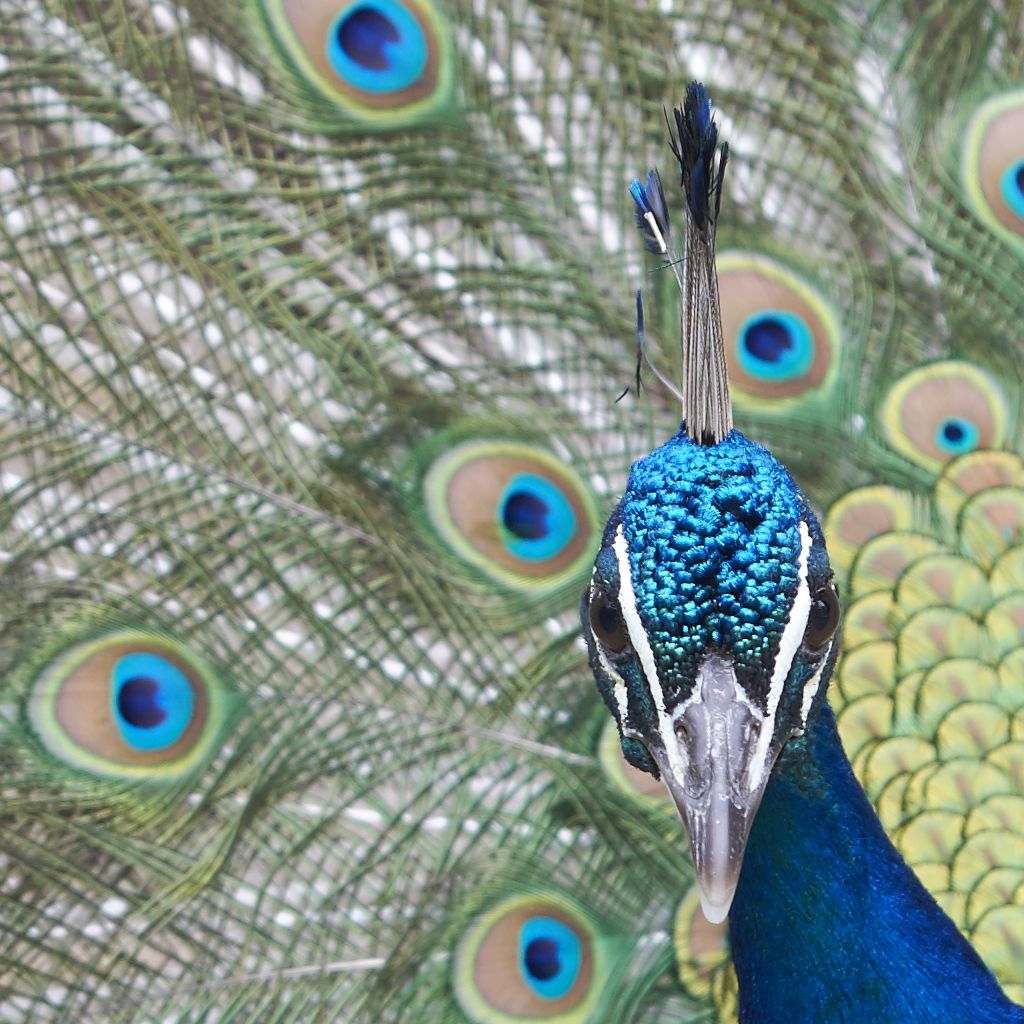
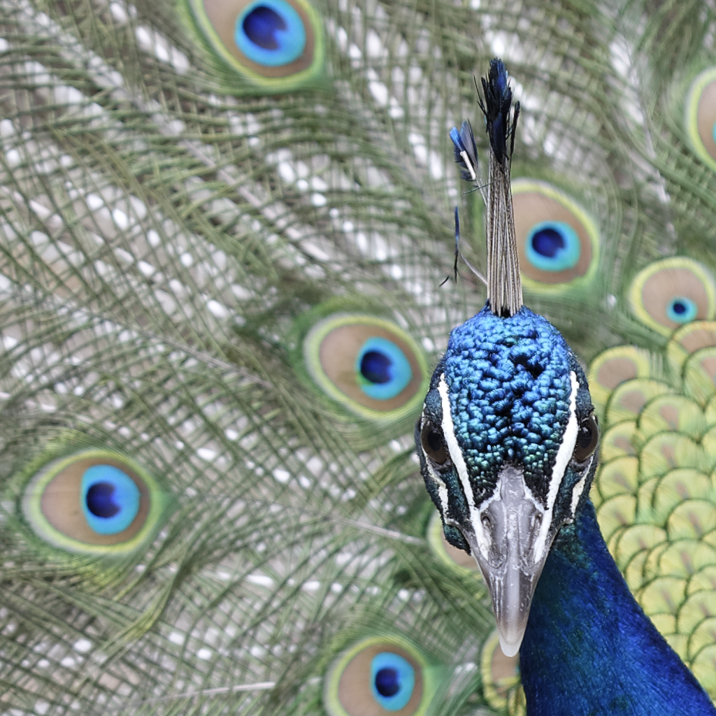
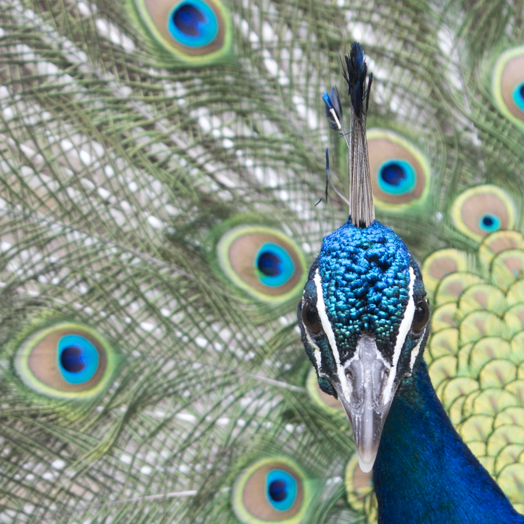
The Peacock
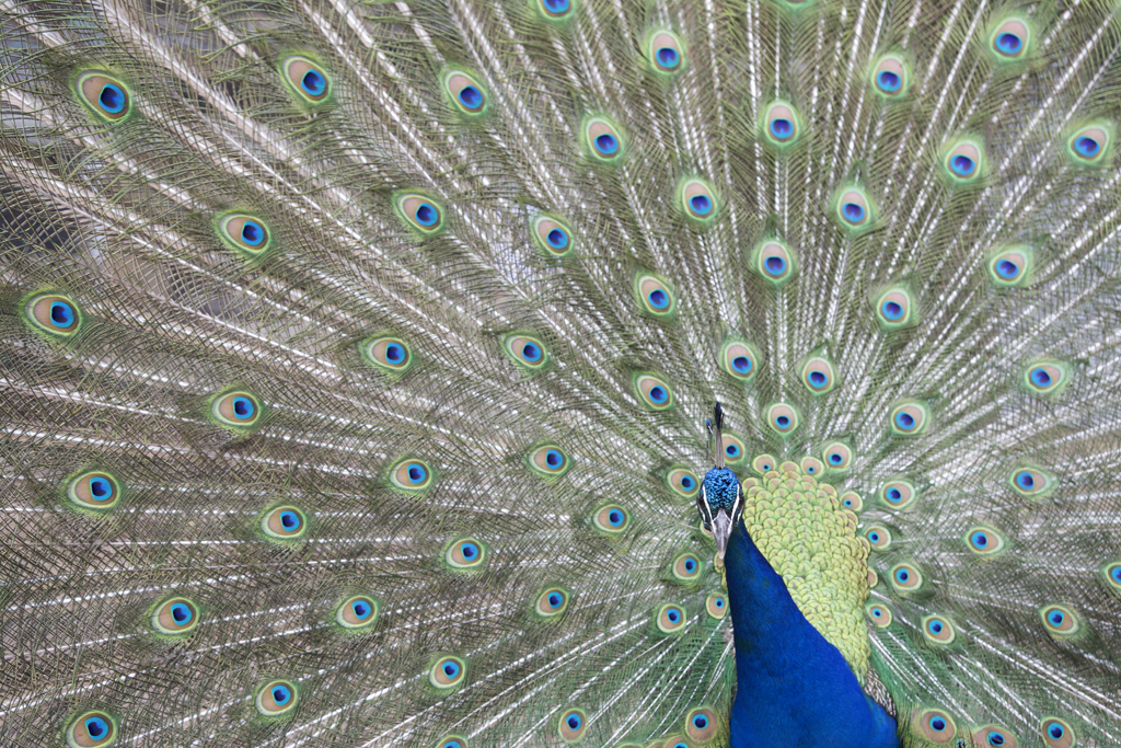
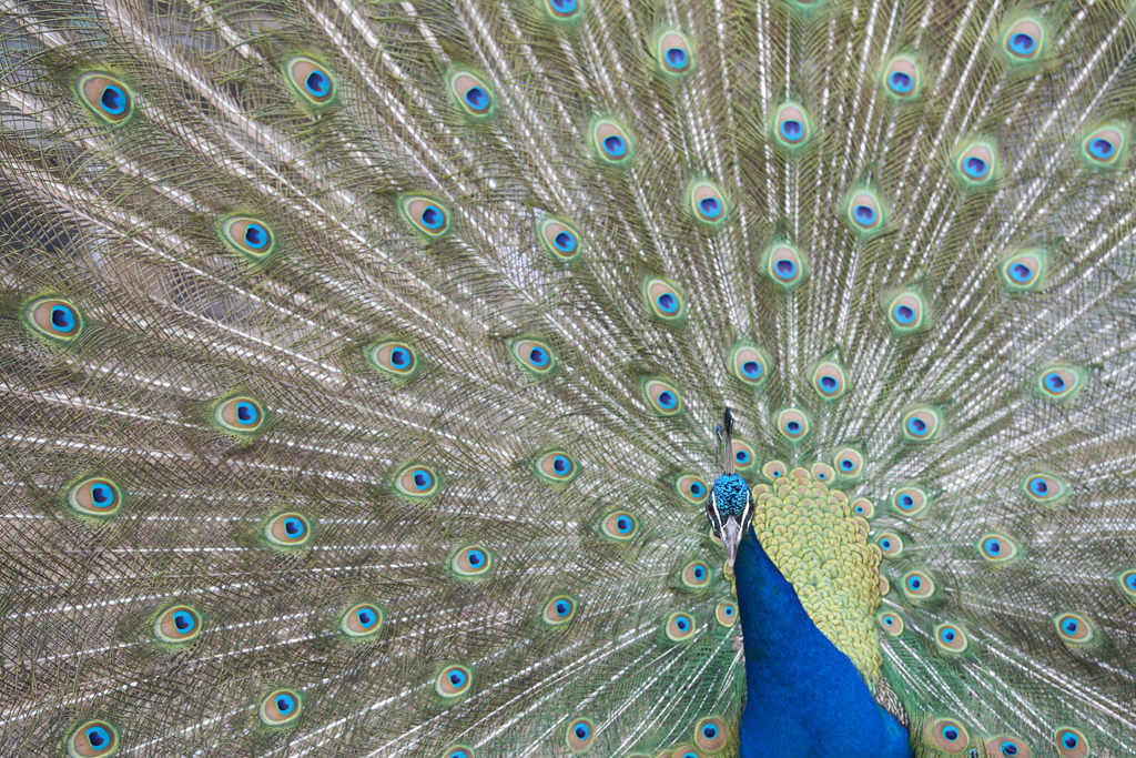
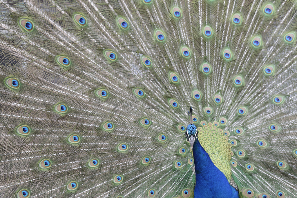
This one has a lot of fine feather detail, but also a lot of slightly out-of-focus feather detail, so it’s an interesting test of how detail vs bokeh are balanced.
I see relatively little difference between the four. The Aperture one has slightly richer colours – especially compared to Lightroom’s, the most flat – and I particularly like Aperture’s rendering of the Peacock’s neck & body. In general Aperture has really deepened the blues.
DxO Optics has rendered slightly higher contrast, or at least brighter highlights – see in particular the top of the Peacock’s head. It’s also again corrected for geometric distortion. But its also produced the softest appearance at this small viewing size.
Aperture, Capture One, and Lightroom have all rendered almost identical levels of detail when compared objectively. Though to my eye for some reason Capture One’s rendition seems slightly softer.
Aperture’s is the outlier here – noticeably softer than the other three. DxO Optics’ is sharper, but a little processed looking. Furthermore, in some patches Lightroom brings out more detail – e.g. the feathers on the head – while in others – e.g. the beak – DxO Optics does a better job.
But they’re all beaten by Capture One, which produces a consistently sharp rendition (albeit with what may appear to be over-processed to some people).
Aperture has also, perplexingly, introduced what look like sharpening artefacts into the background feathers – see in particular the hair-thin (no pun intended) outline of the blue ‘eyes’ on the feathers. I slightly dislike Aperture’s rendering of the background here.
Judgement
It’s pretty close overall, but I give this one to Capture One. If I were pushed a bit, I’d rank Aperture’s rendition barely last – despite its pleasing blues – with Lightroom only slightly above, and DxO Optics in second place.
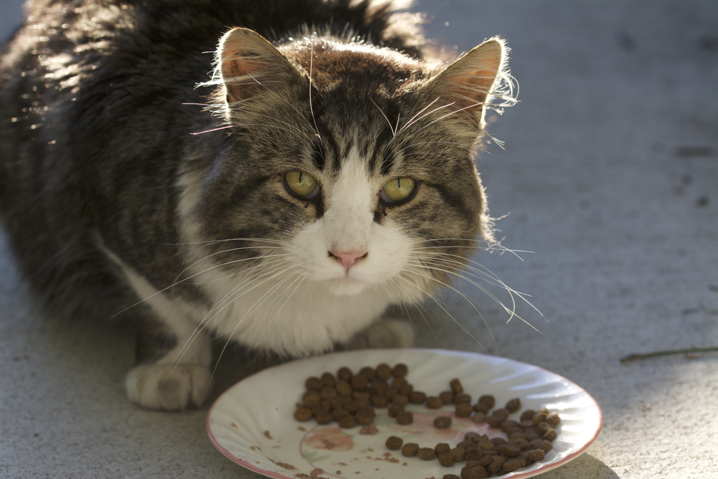
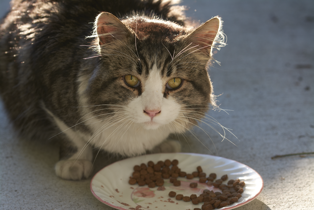
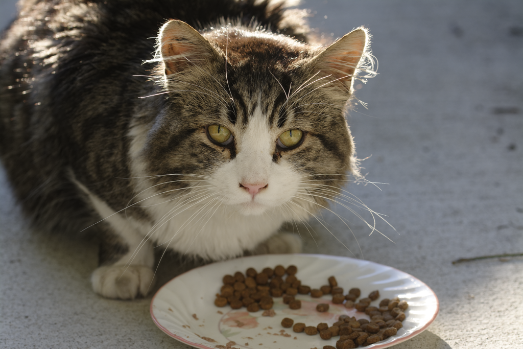
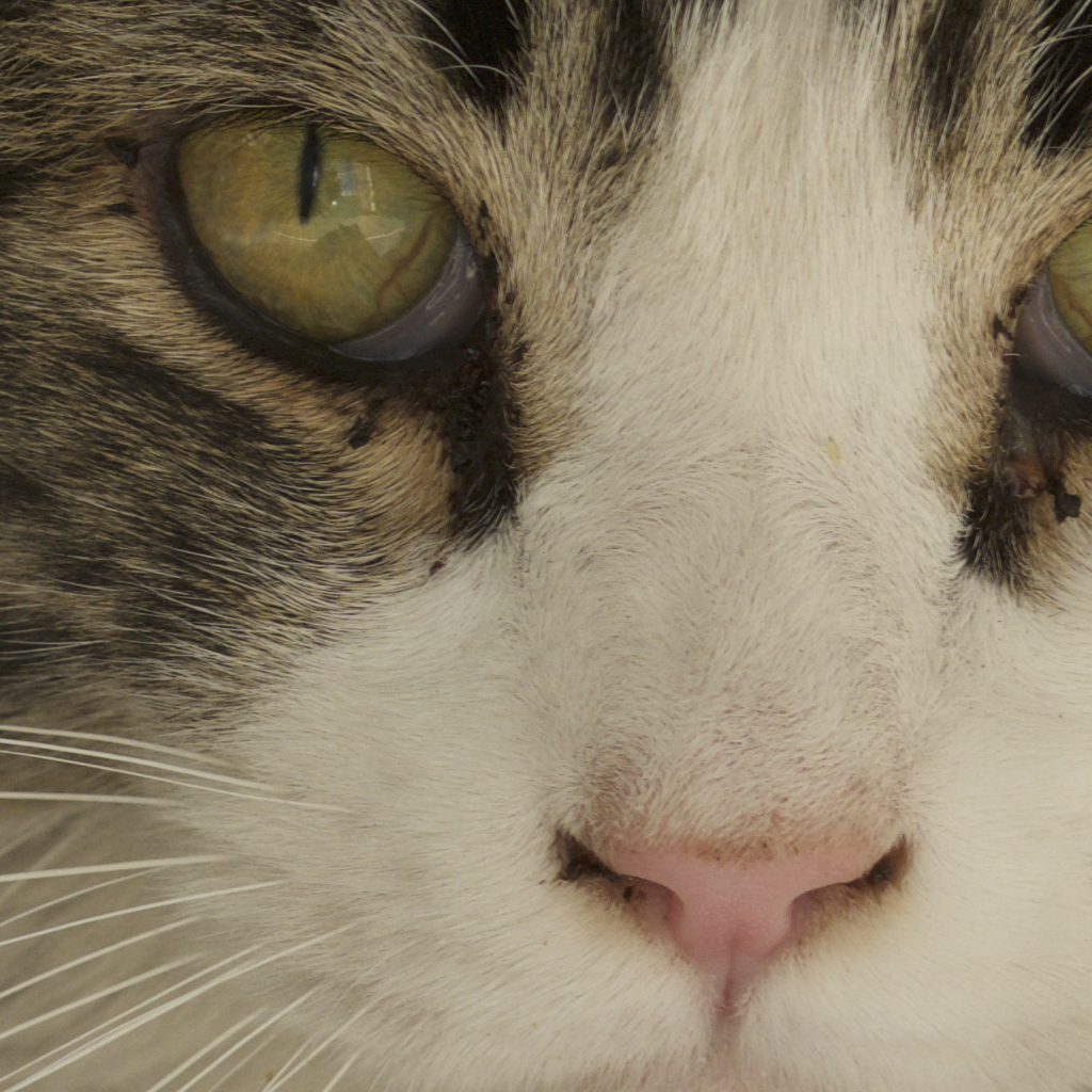
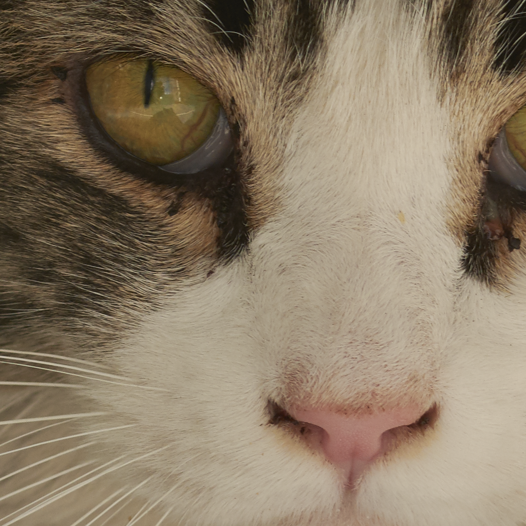
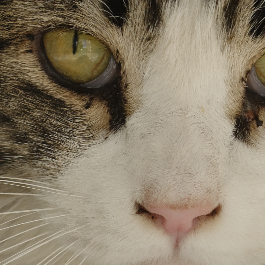
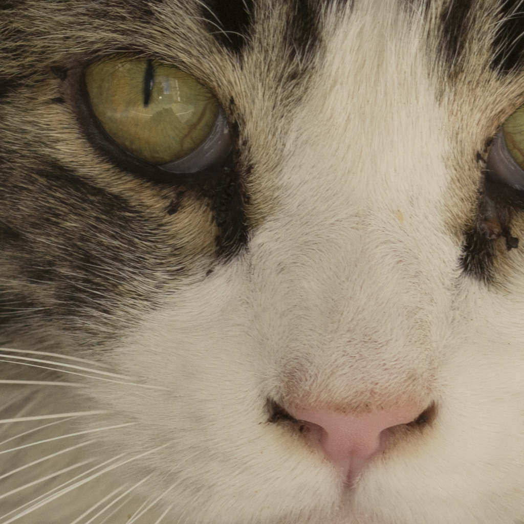
The Cat
I photograph a lot of animals. Good rendering of hair and fur is critical.
DxO Optics has gone for a noticeably ‘stronger’, contrastier rendition. It looks ‘processed’ (in the negative sense of the word) side-by-side with the others, but I suspect if viewed on its own it wouldn’t.
I find Capture One’s rendition a tad flat, and consequently seemingly a bit soft (even though objectively it’s not). I’m starting to see a trend here, whereby Capture One could benefit from a tad more contrast by default.
I slightly prefer Aperture’s rendition to Lightroom’s. Though overall they’re very similar, and I think most of the difference comes down just to colour temperature – Lightroom’s being a truer neutral white-balance, while Aperture’s is warmer. Lightroom has also applied more contrast than Aperture, too.
Capture One’s rendition stands out to me as the best, by some margin. Capture One has done a noticeably better job of rendering the fine fur, in a detailed but still very natural way. Its rendition has genuinely more fine detail than any of the others produced.
In contrast, literally and figuratively, DxO Optics has again gone for a more ‘processed’ look. Despite its obviously stronger sharpening, it’s actually rendered slightly less detail than Capture One.
Curiously, though, Lightroom seems to have done a better job rendering the eye. There’s significantly more fine detail in there, particularly within the iris under the reflections. Capture One and especially DxO Optics have lost detail there. But it comes at the expense of visible noise, which is not present in the others’ renditions.
I’m surprised how well Aperture stands up for itself in this particular case. I’ve long been frustrated with Aperture’s poor rendering of hair & fur, but in this specific example it doesn’t do a terrible job. While not the best, it’s done just as good a job as Lightroom at bringing out genuine detail, and done so with less noise.
Judgement
Though I do like DxO Optics rendition when viewed small, at the pixel level it hasn’t done nearly as good a job as Capture One, and Capture One is a quick contrast adjustment away from the same nicely balanced look. In fact DxO Optics is probably in last in this one, due to its over-sharpened look with no more actual detail than Aperture or Lightroom.
Aperture & Lightroom are very close, with the difference really just being in the level of basic sharpening applied. Neither stands up to Capture One, though, which is the clear winner.
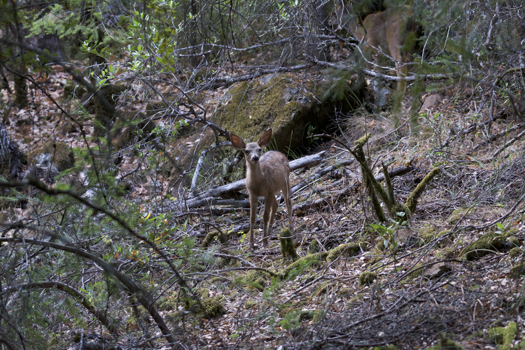
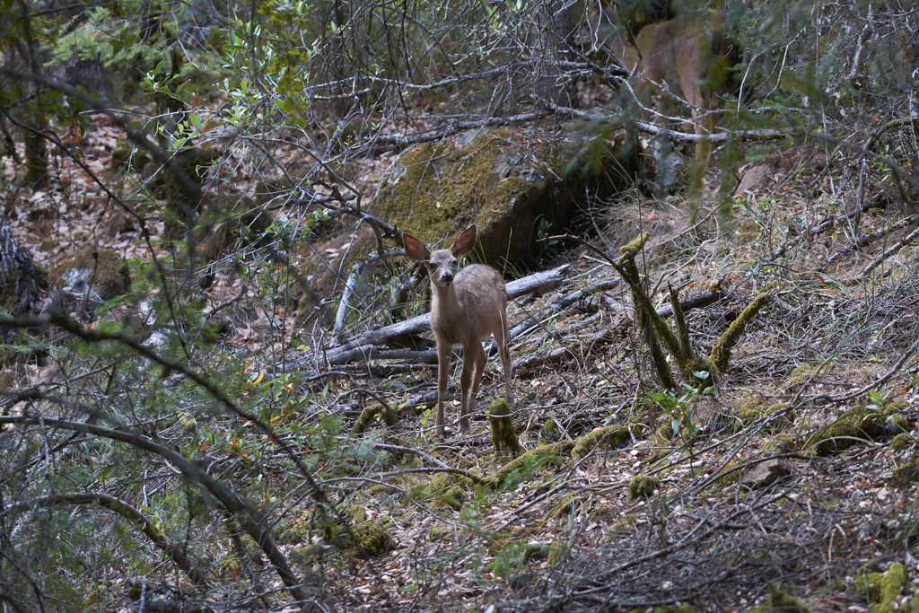
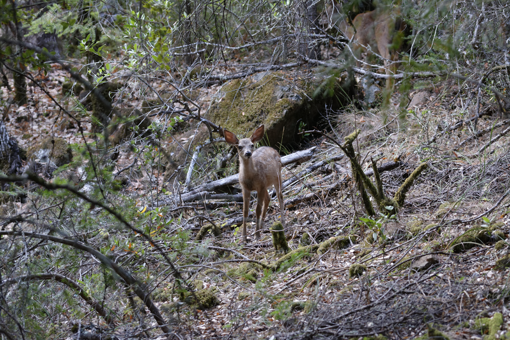
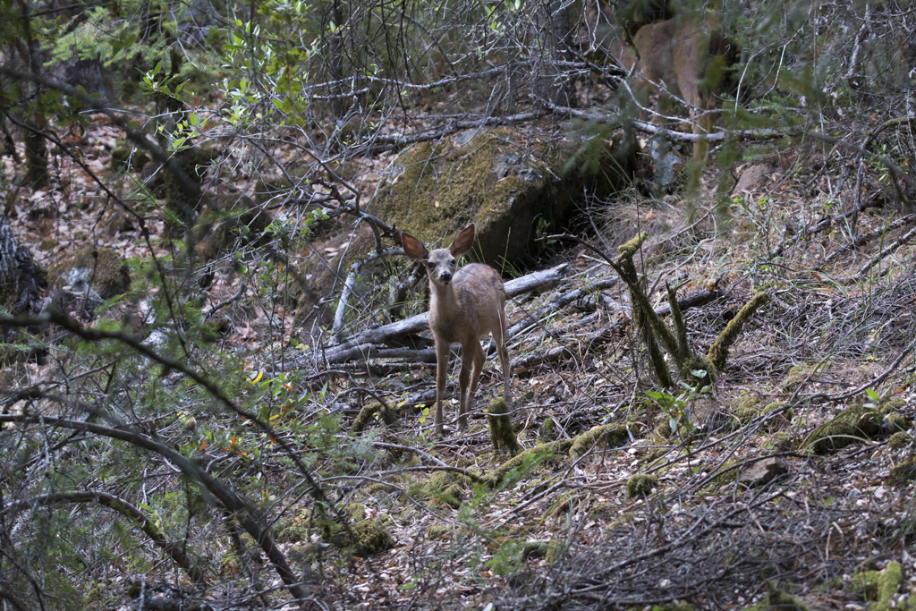
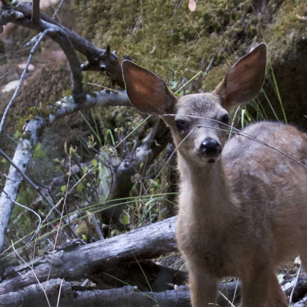
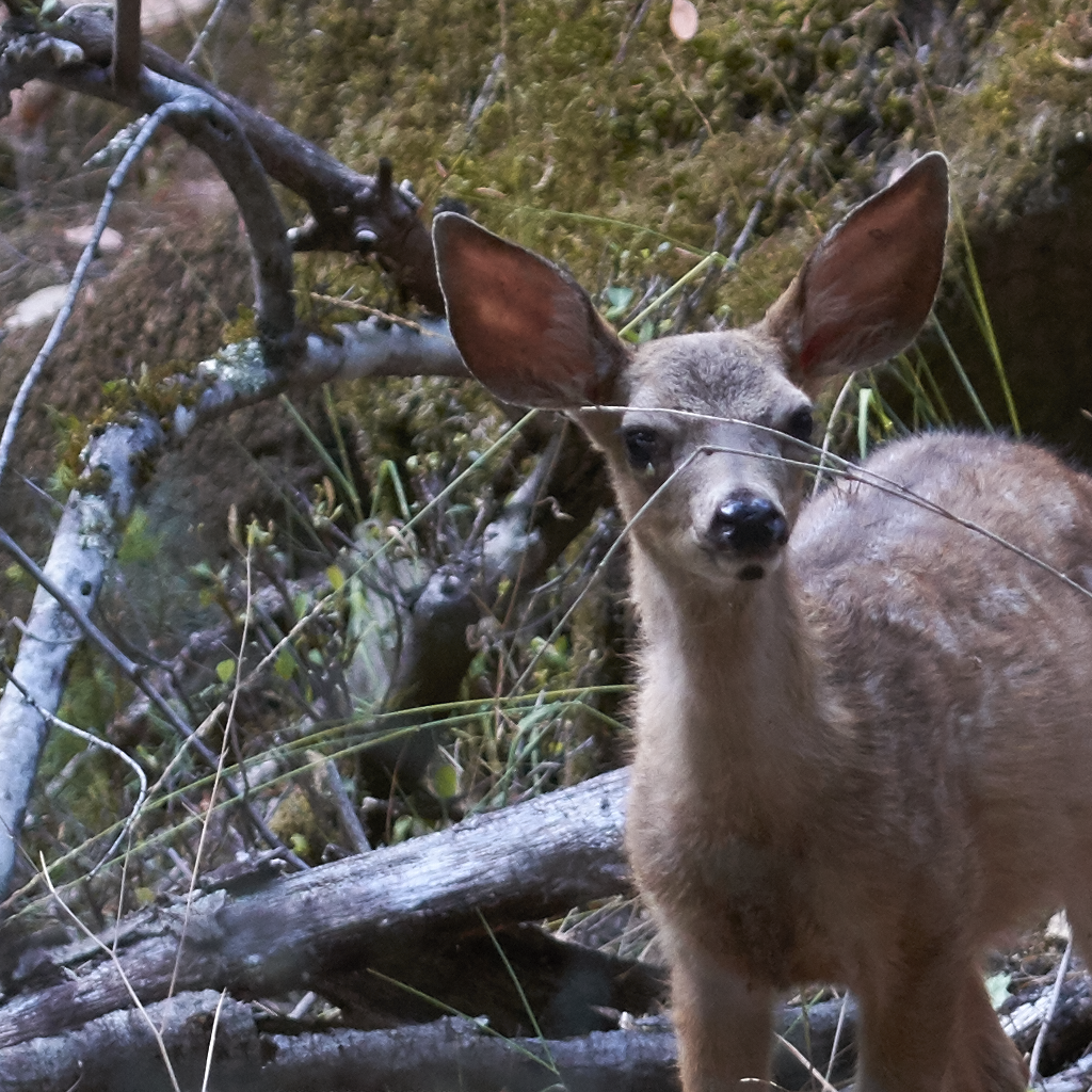
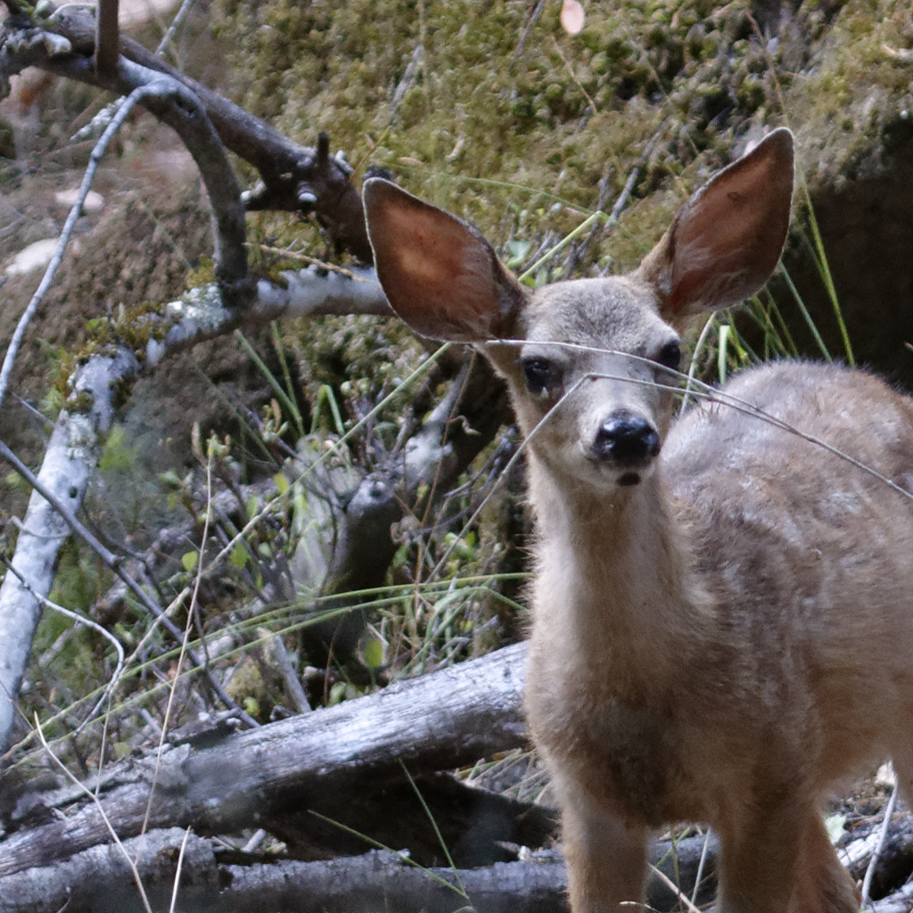
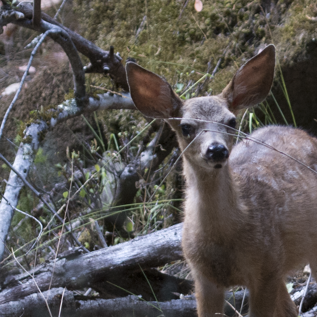
The Deer
The wildlife shooter’s bugbear – a cute subject too far away, in too little light, with way to much stuff going on around it, visually. This one’s got high ISOs, camera motion blur, and relies especially on fine detail because it’s invariably going to be cropped a lot. The rendering of the busy, only slightly out-of-focus background is also critical.
Frankly, with such a noisy scene – both image noise and subject noise – there’s very little in it between all four contenders. I have a very slight preference for Capture One’s colour rendition – it’s pulled down the highlights in particular, to produce slightly richer, more pleasing greens. Aperture is not not far behind. DxO Optics & Lightroom have gone for relatively dull colours – DxO Optics especially.
Worth noting is that none of the four can save this particular image.
I think overall Capture One has done the best job of balancing detail with noise. While I do like the level of detail Lightroom has rendered, it’s done so – as with The Ceiling – at the expense of much more noise than the others. That said, Capture One has done a particularly poor job of rendering the fur on the deer’s neck, such that even Aperture bests it there.
Lightroom has also rendered the background and surrounds noticeably busier – Capture One is my favourite of the four, in this aspect, followed by Aperture, and then DxO Optics.
Judgement
Capture One clearly wins, but by a small margin, and it’s a hollow victory because it’s still not good enough to compensate for the mediocre source raw. The other three are close enough to be called tied, and sensitive to personal preference (particularly w.r.t. Lightroom’s much noisier rendition).
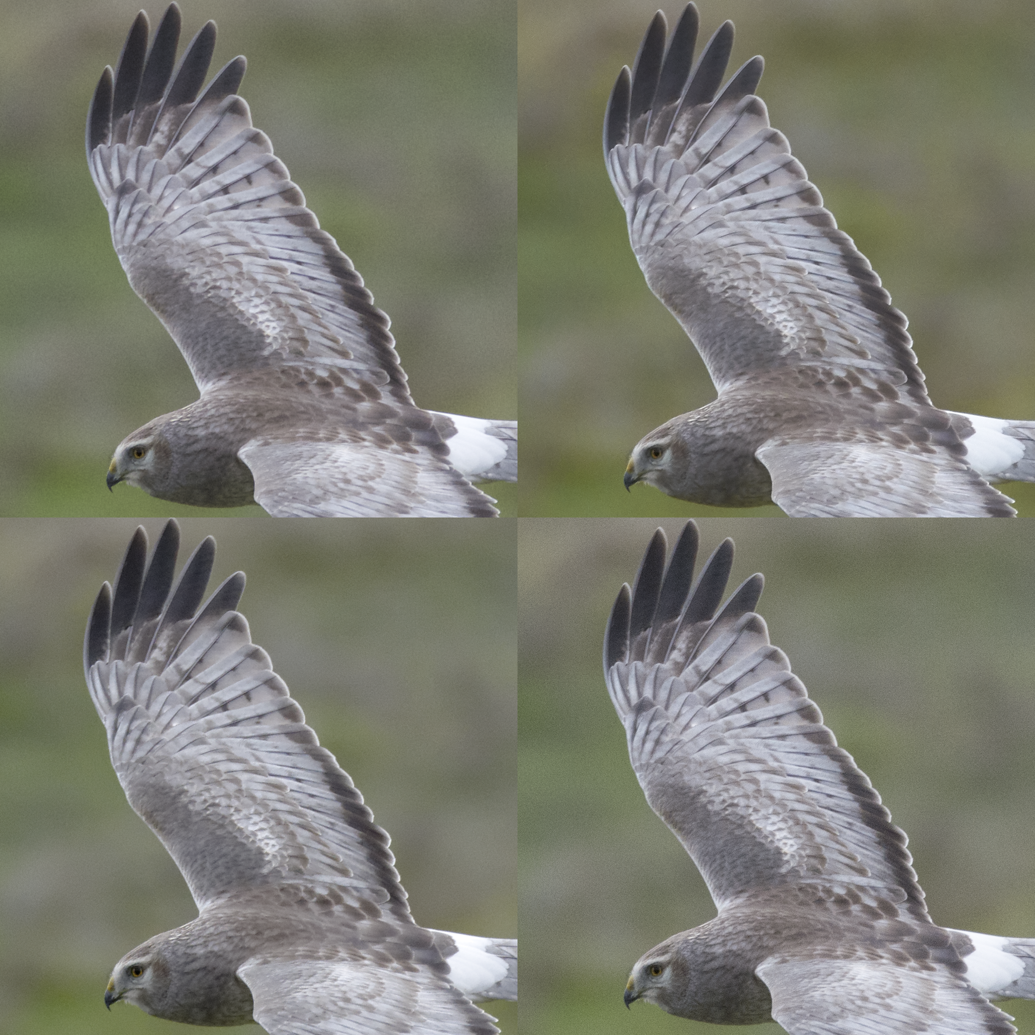
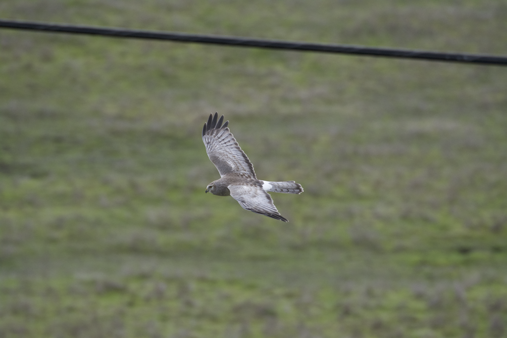
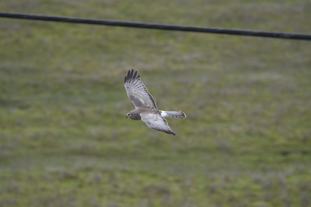
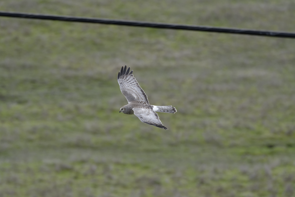
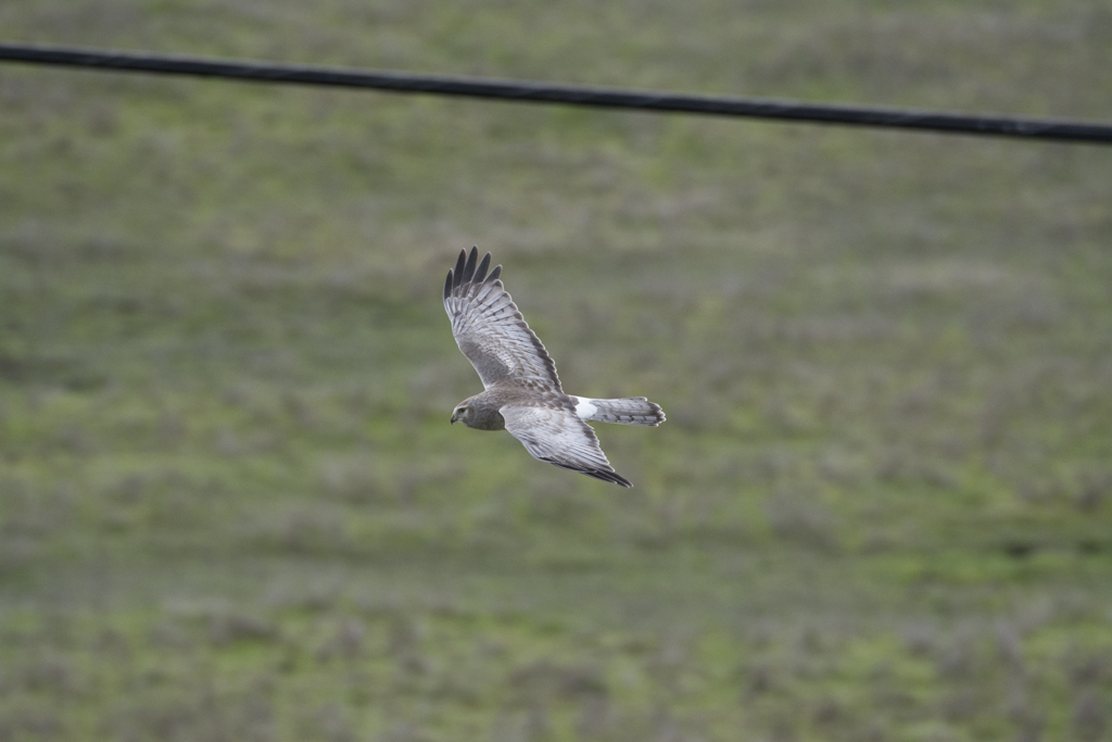
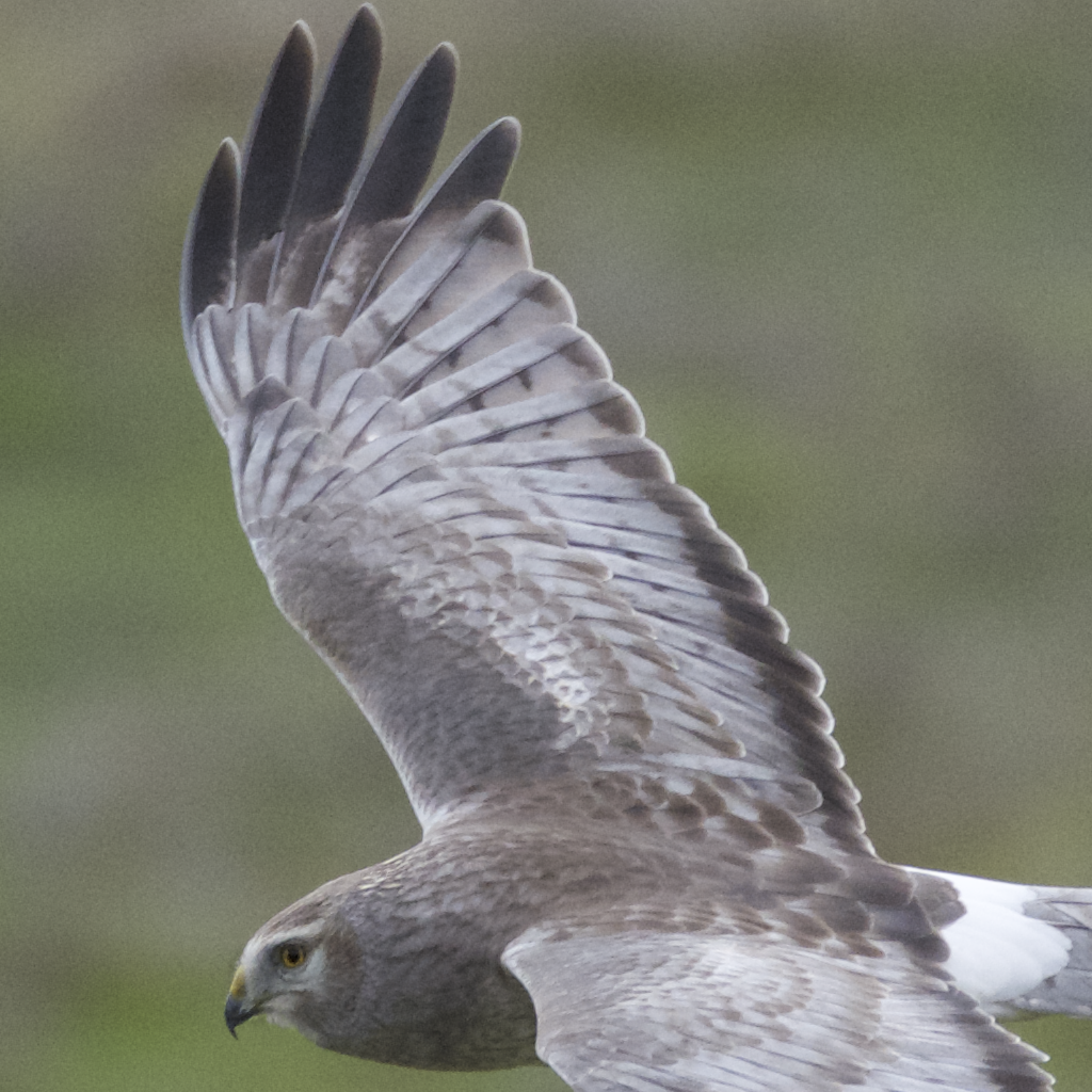
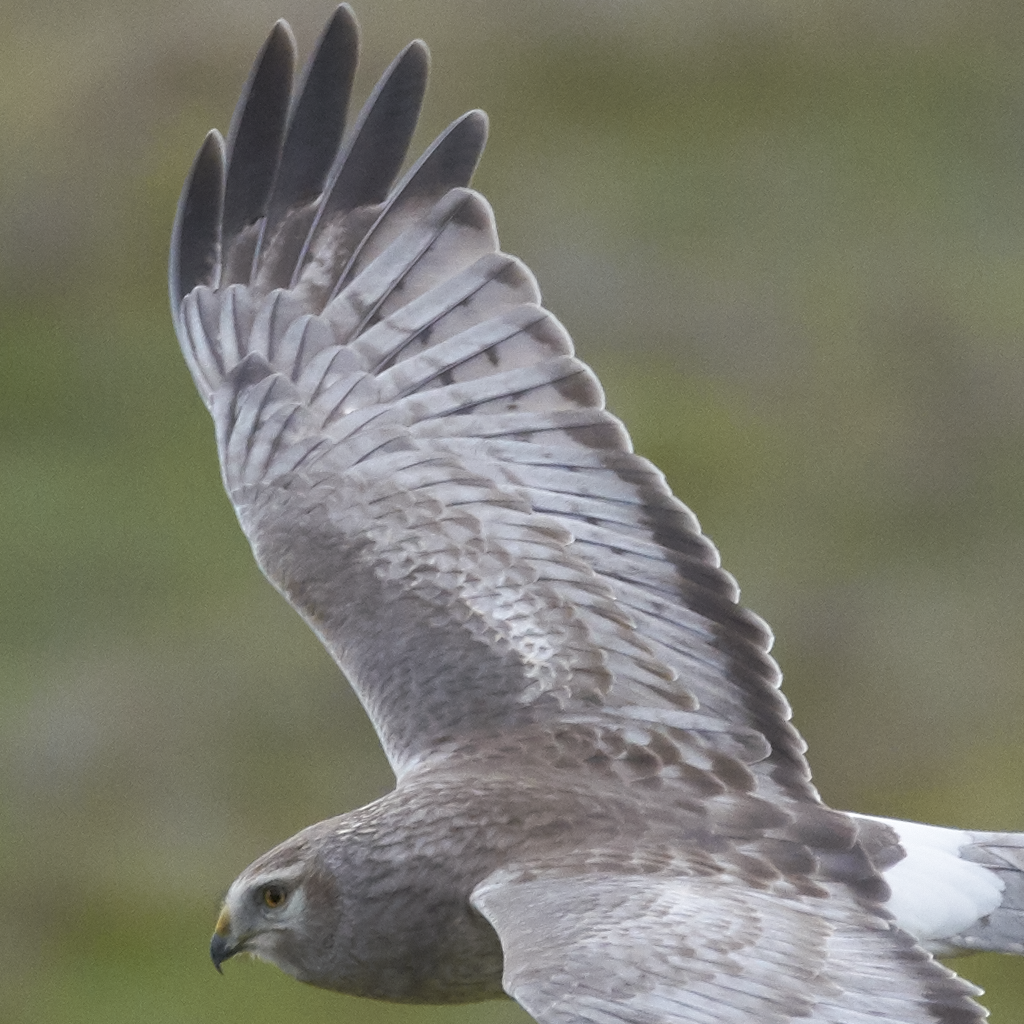
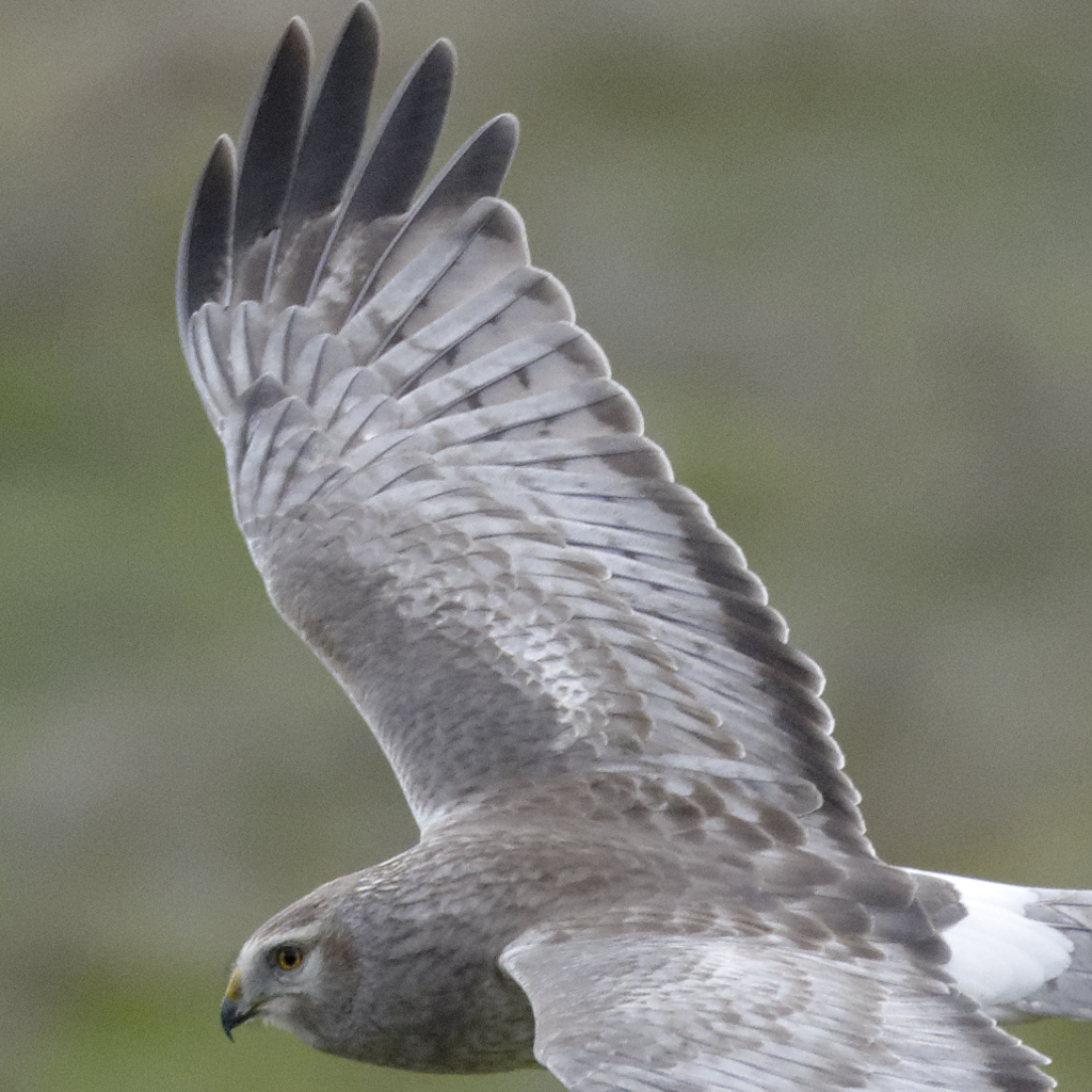
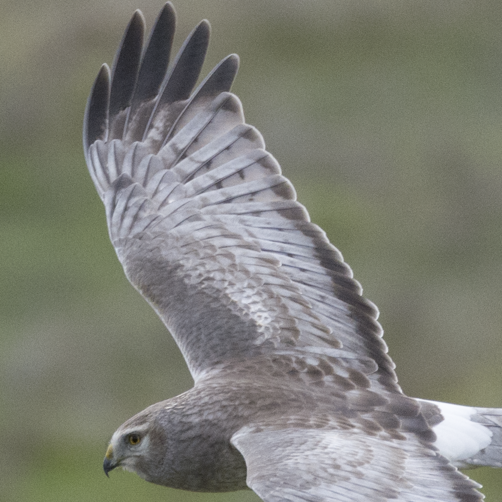
The Harrier
A pretty typical bird-in-flight shot – which I ostensibly try to eschew as both cliché and difficult to capture, but which is nonetheless represented in its fair share of my library. There’s something in the challenge of capturing a wild animal in its fast motion.
As with the previous image, the actual subject is so small in the frame that the differences there are insignificant.
Something about Lightroom’s rendition of the out of focus background is more pleasing to me than any of the others’, though it’s a very small difference.
And Capture One has rendered the greens noticeably richer, in a not unpleasant but still subjective way. It does make the Harrier pop much more off the background, which is a big plus in this kind of photography.
Capture One does the best job to my eye, though the differences are minor. Perhaps its biggest differentiator is the relatively low noise – the background is noticeably less noisy and thus more pleasing. Though that’s also something that’s relatively easy to selectively noise reduce, in a shot like this.
Objectively, however, Lightroom has brought out the most genuine detail. The Harrier’s breast, for example, has actual feather detail in Lightroom’s rendition, detail which is simply gone – visibly smeared out, as if by overly-aggressive noise reduction – in Capture One’s rendition. Aperture & DxO Optics actually both also do a better job of preserving that detail, though at the expense of higher noise levels than Capture One.
I do like how DxO Optics has emphasised the detail in the harrier’s head, with its slightly stronger sharpening, though it looks like a fairly straight-forward trade-off with noise, and in fact on the feathers more generally I see more detail from Capture One.
Aperture’s rendition is the worst, with both relatively high noise and relatively little feather detail – with the notable exception of around the face, where it bests Capture One. Lightroom is not much better, with more detail but also the most noise. However, Lightroom renders the noise as very even, very fine-grained. Aperture’s also high noise is a little blobier. For less than 100% viewing, Lightroom’s noise will likely average out better than Aperture’s.
Judgement
It’s a toss-up between Capture One and Lightroom – low noise vs more detail, respectively. DxO Optics comes in third, with its slightly more aggressive processing that is nonetheless still reasonable and pleasing in this case. Aperture comes in close last, mainly just on the basis that it has relatively ugly noise (and plenty of it) compared to the level of detail it brings out.
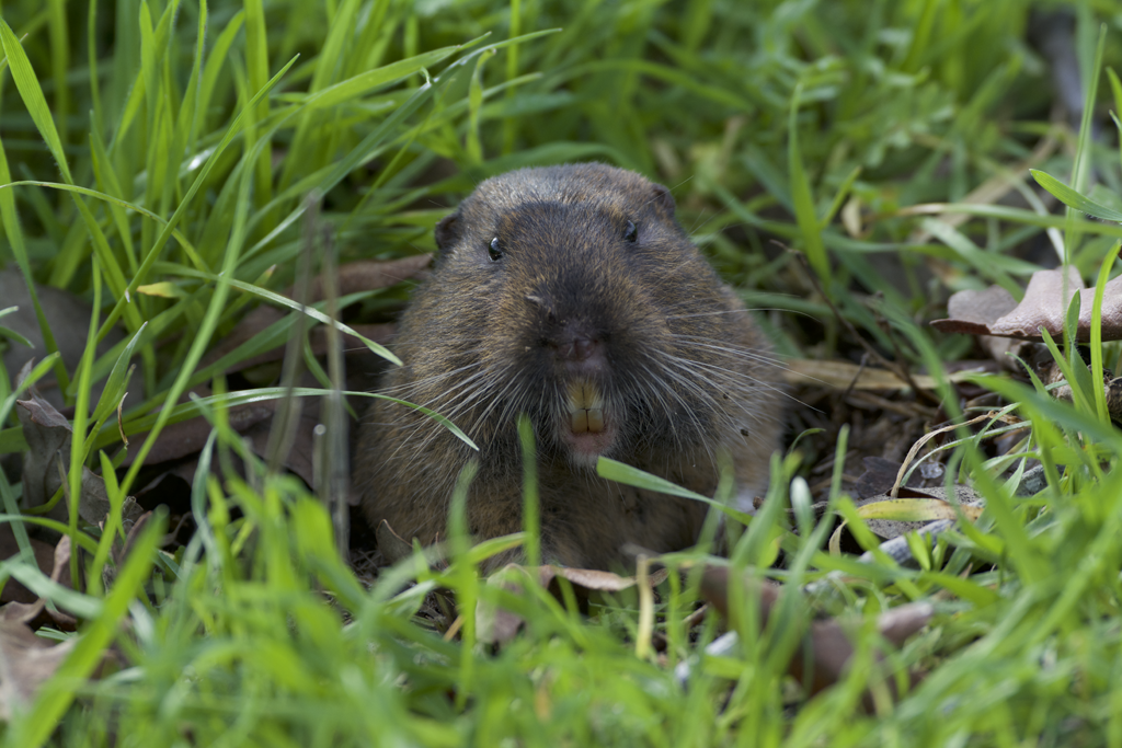
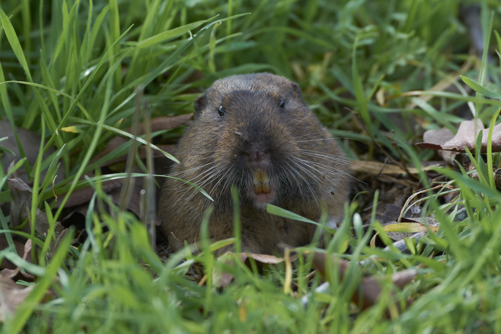
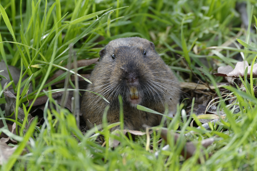
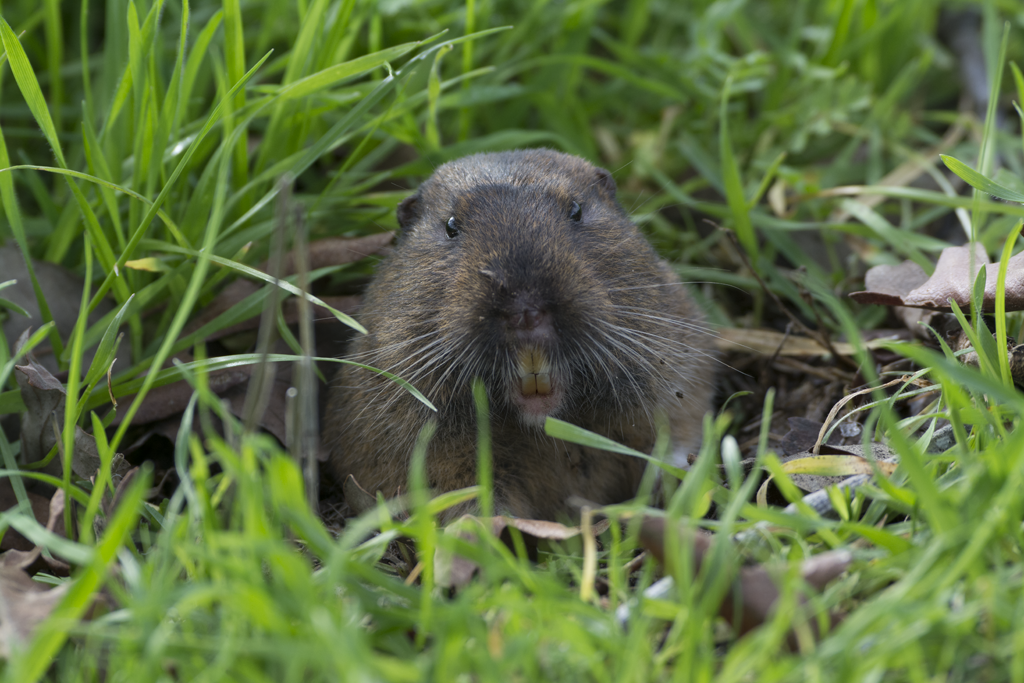
The Gopher
A very typical close-up wildlife shot. Depth of field is an issue, backgrounds are noisy, and ISO is creeping up into the midranges.
Capture One has rendered this was unusually flat, in stark opposition to DxO Optics which has gone for a highly-processed, vibrant look. Though a bit strong, I do like the general direction of DxO Optics’ rendering w.r.t. contrast & clarity – look at the teeth, for example, to see how much more attention they draw in DxO Optics’ rendition. It’s not realistic, but it does have an aesthetic I could get into (with some refining editing).
Capture One’s rendition is noticeably flatter, which can lead you to think it has less detail overall, though objectively this isn’t true.
Lightroom and Aperture are similar – colours are realistic if a bit dull by conventional standards; acuity appears reasonable. Aperture has under-exposed slightly, to my eye.
Capture One has done the best overall job, to my eye, w.r.t. fine details. It’s rendered significantly more fine detail in the gopher’s fur, to the extent that it’s made the depth of field effectively quite a bit larger. But its sharpening has started to over-emphasise the speckled highlights in the fur, which renders that part of the fur less attractive than Lightroom or Aperture’s renditions.
DxO Optics has actually done a pretty respectable job in this case. It hasn’t actually rendered any more genuine detail than Capture One, and as we’ve seen here previously, its results tend to look more artificial and ‘over-sharpened’, but its more aggressive and stylised lighting adjustments have done well here – bringing out good mid-level detail; achieving a better overall exposure than any of the other contenders; and really drawing attention to the eye.
Lightroom’s rendition is rather flat, in obvious contrast to DxO Optics’, well, contrast. In most other respects, it’s very similar to Aperture’s – the main difference being that Lightroom has more sharpening applied, for more apparent (but not genuine) detail and correspondingly more noise. In any case, Aperture & Lightroom’s renditions are obviously lacking in fine detail compared to the other two’s. Lightroom’s is also a tad over-exposed.
In regards to noise, there’s not a dramatic difference between the four of them, though the pattern seen so far repeats – Lightroom renders the most noise, DxO Optics the least – though with coarser, less attractive noise for what is left in there. Capture One does a rather good job of keeping noise fine-grained and minimal – without compromising detail – while Aperture does a notably poorer job of it, comparing favourably only to Lightroom.
Judgement
It’s a toss-up between Capture One and DxO Optics. I suspect that, with quick & minor edits, you could turn either into a nice mid-ground, with DxO Optics’ more pleasing lighting (possibly just a quick jolt of the ‘Clarity’ slider) and Capture One’s more natural fine detail & noise. The difference is certainly within the bounds of reasonable personal preference.
There’s not much in it between Lightroom and Aperture, but Lightroom’s slightly higher noise and slightly washed-out appearance punt it into last place.
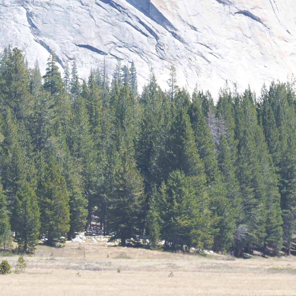
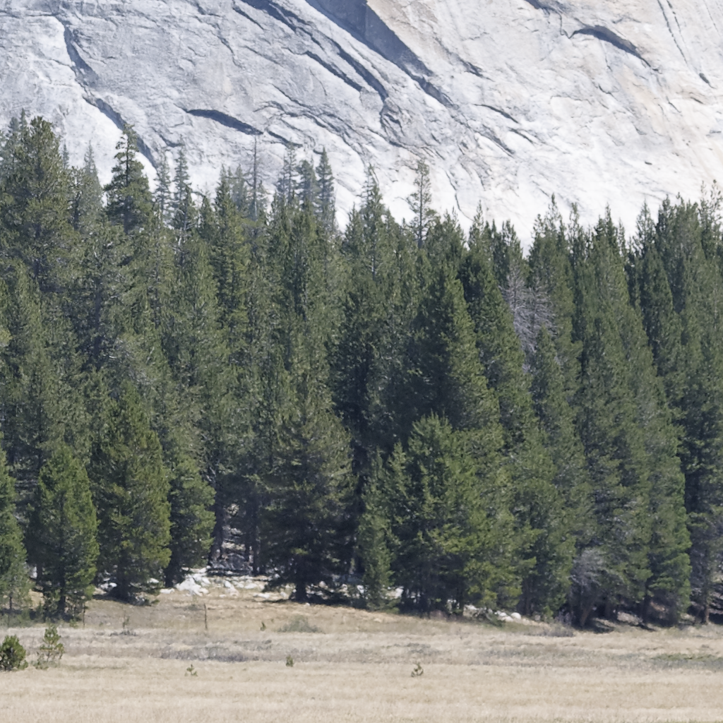
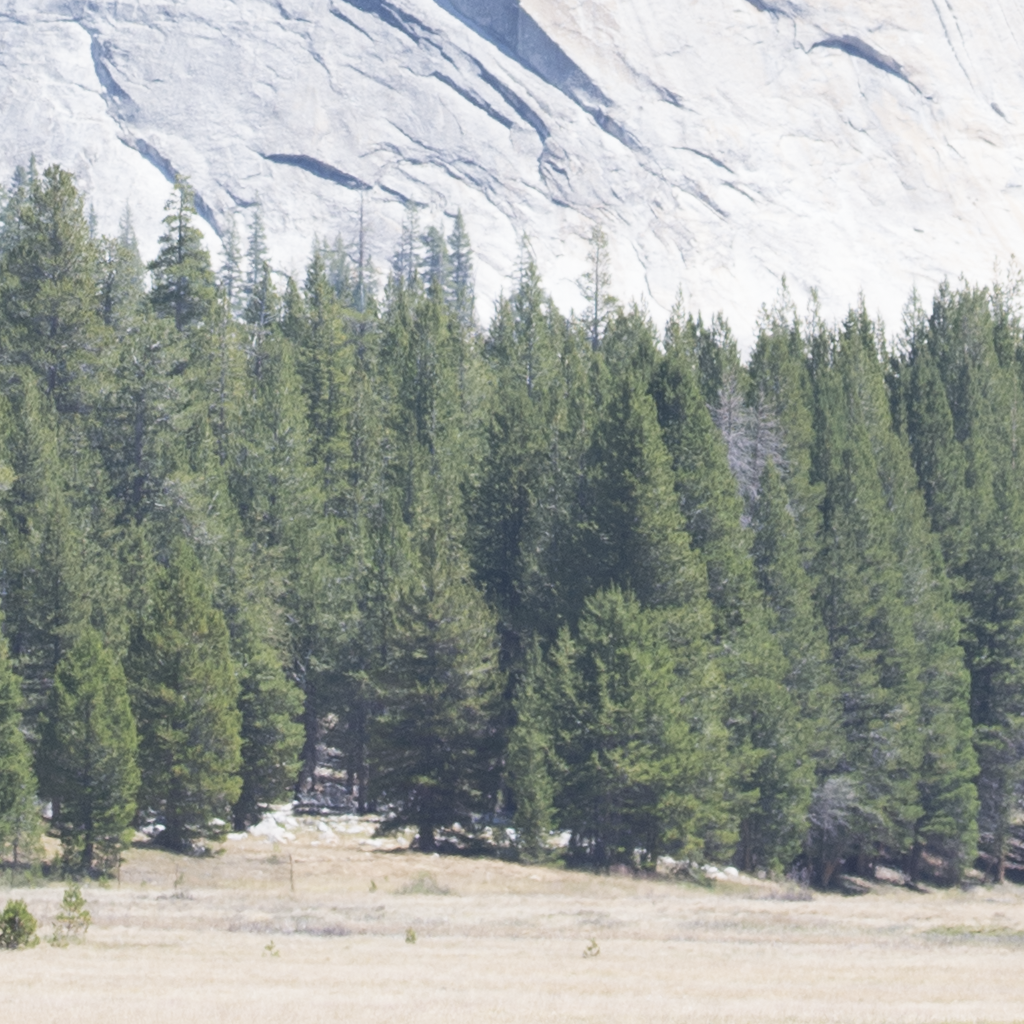
The Granite
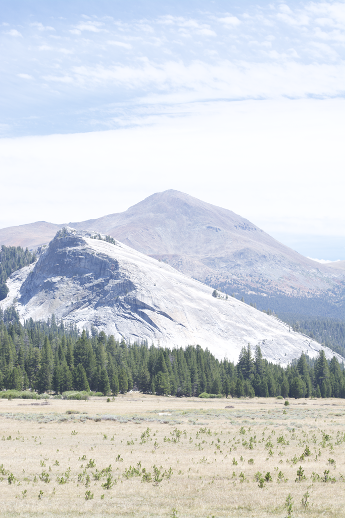
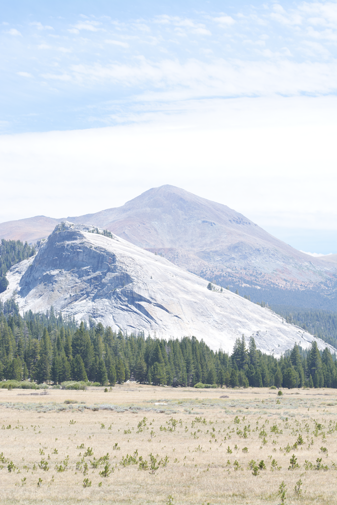
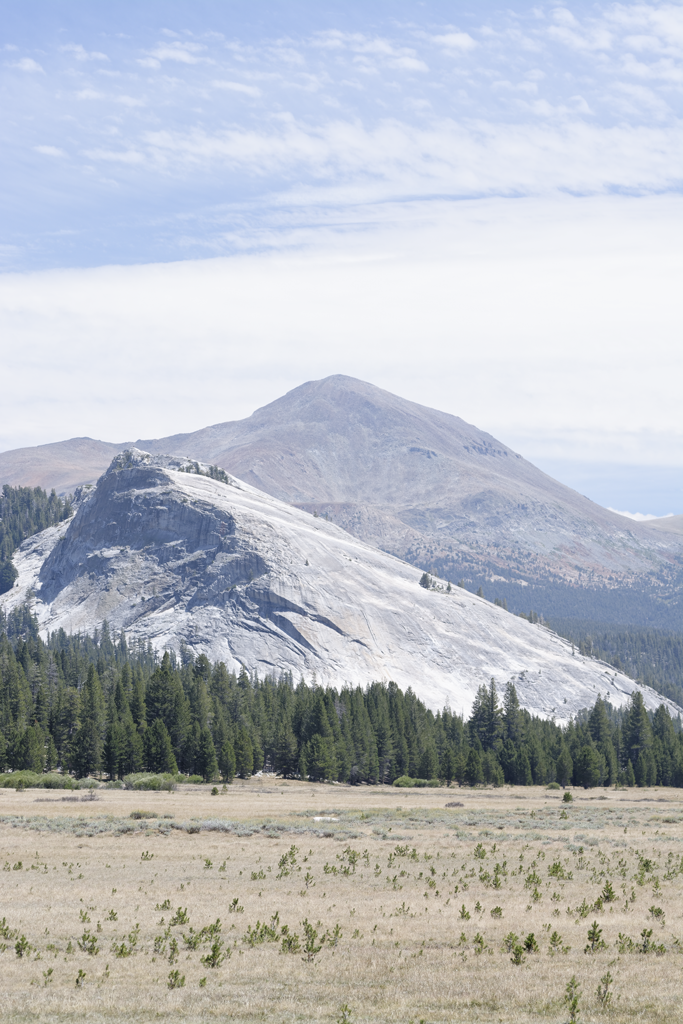
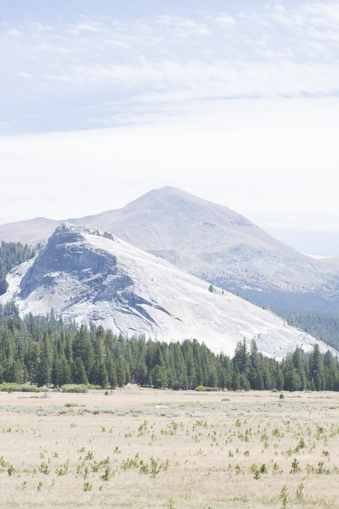
This is representing all the lazy holiday snaps. This particular one is just a single shot towards a large panorama, so ignore the disinteresting subject and awkward framing. It’s also a bit over-exposed, which is not atypical in mid-day-sun landscape photography (nor, especially, in panoramas where the dynamic range can be especially high).
It’s quite subjective in this case, but I am drawn to DxO Optics’ version first and foremost, despite its lower vibrance. Overall exposure is also a bit low, but it’s brought out the most detail in the over-exposed clouds, rendered the sky a pleasingly deeper blue, and the trees and granite mountains with more contrast. The underexposure & reduced vibrance (saturation & luminosity in the greens) shows up particularly in the grass in the midground, but that’s trivial to address with a quick edit.
Aperture has rendered the white clouds closer to actual white, which I prefer over the slightly duller renditions by Capture One & Lightroom. In fact it’s produced an overall higher contrast rendition than Capture One & Lightroom, which I find more pleasing overall. That higher contrast has also given the appearance of greater detail.
There’s not much going for Capture One nor Lightroom in this case. In fact Lightroom’s rendition seems noticeably softer than any of the others’ (possibly just due to the lower contrast).
Now we can see that there’s actually a pretty dramatic difference in fine detail between the four. While Aperture’s rendition looked surprisingly good relative to the others’, it looks like that was really just a result of its higher contrast – when it comes to true fine detail, it has none. It looks positively out of focus compare to Capture One & DxO Optics’ versions. And the same goes for Lightroom, which yields very similar results to Aperture.
DxO Optics has done a rather good job in this case of bringing out detail without looking over-processed, as it has tended to in the other pictures. It beats even Capture One this time around, though the difference between those two is small compared to the big loss of detail going down to Aperture or Lightroom.
Judgement
I think DxO Optics wins this one. Not by much – as noted, Capture One’s rendition is similar and either could likely be turned into the other with quick & simple edits.
Aperture & Lightroom are clear losers here. They render dramatically less detail. Aperture at least redeems itself somewhat with a more pleasing overall look – that, when viewed relatively small, has good contrast and good apparent detail. Shoving Lightroom to clear last.
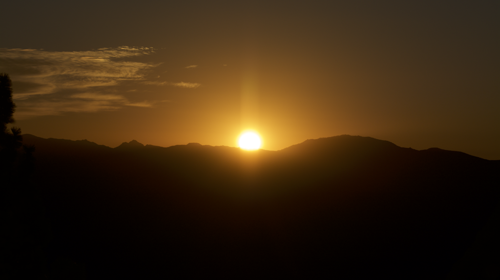
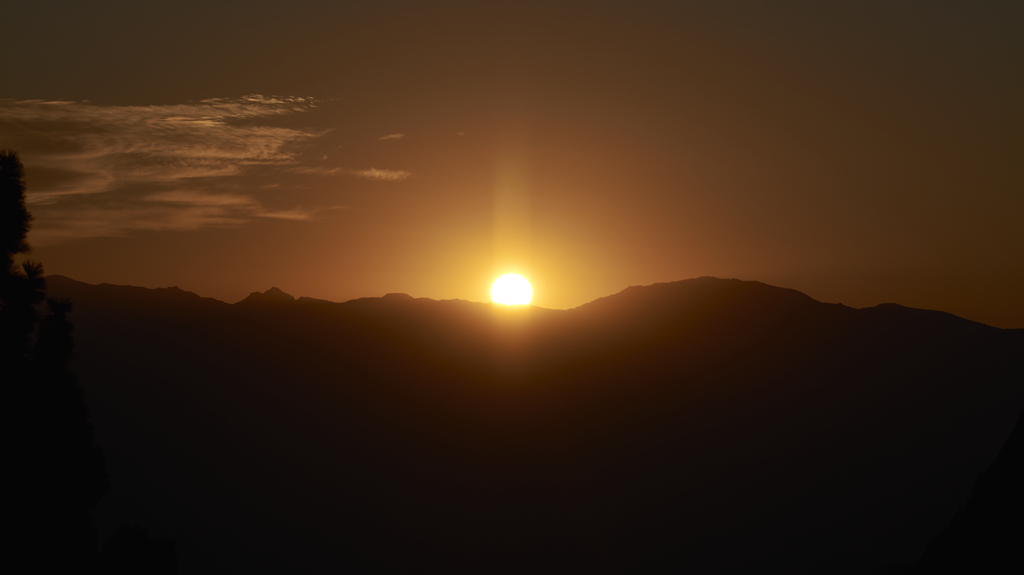
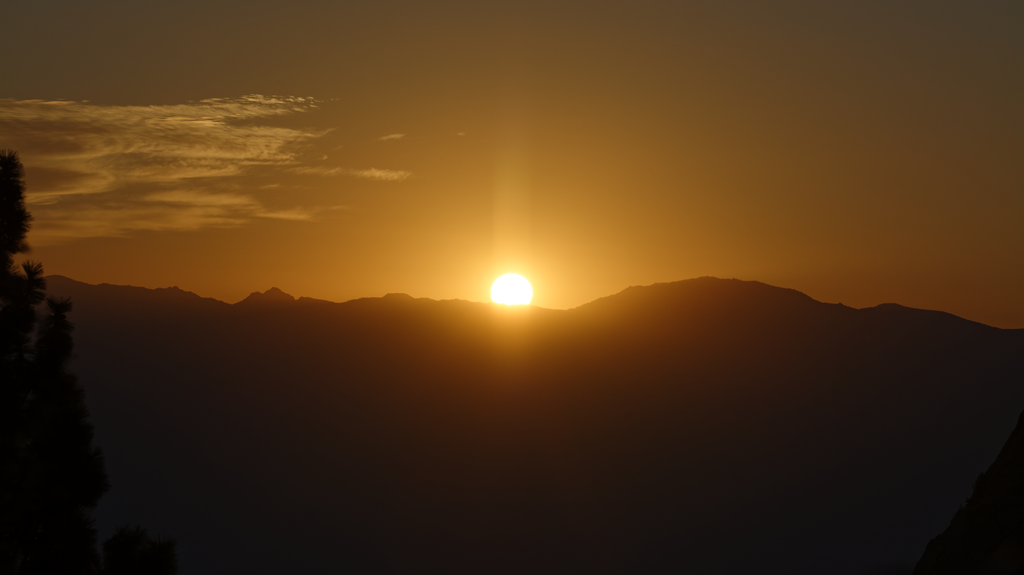
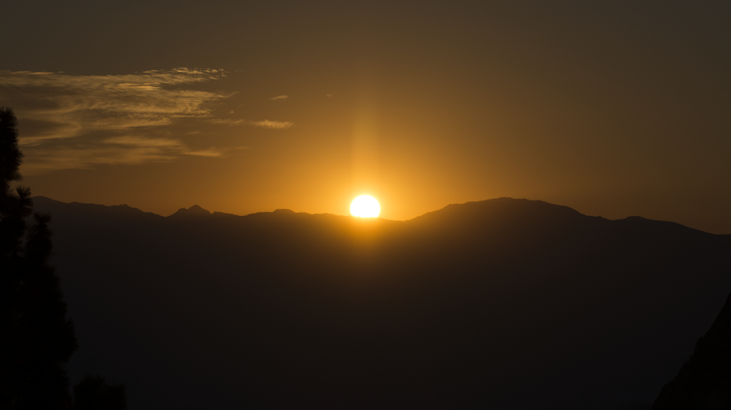
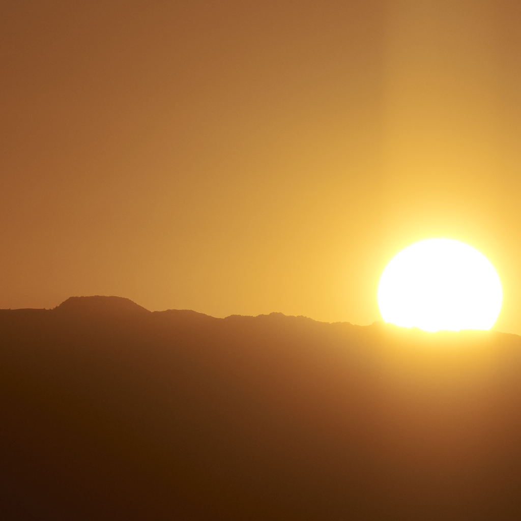
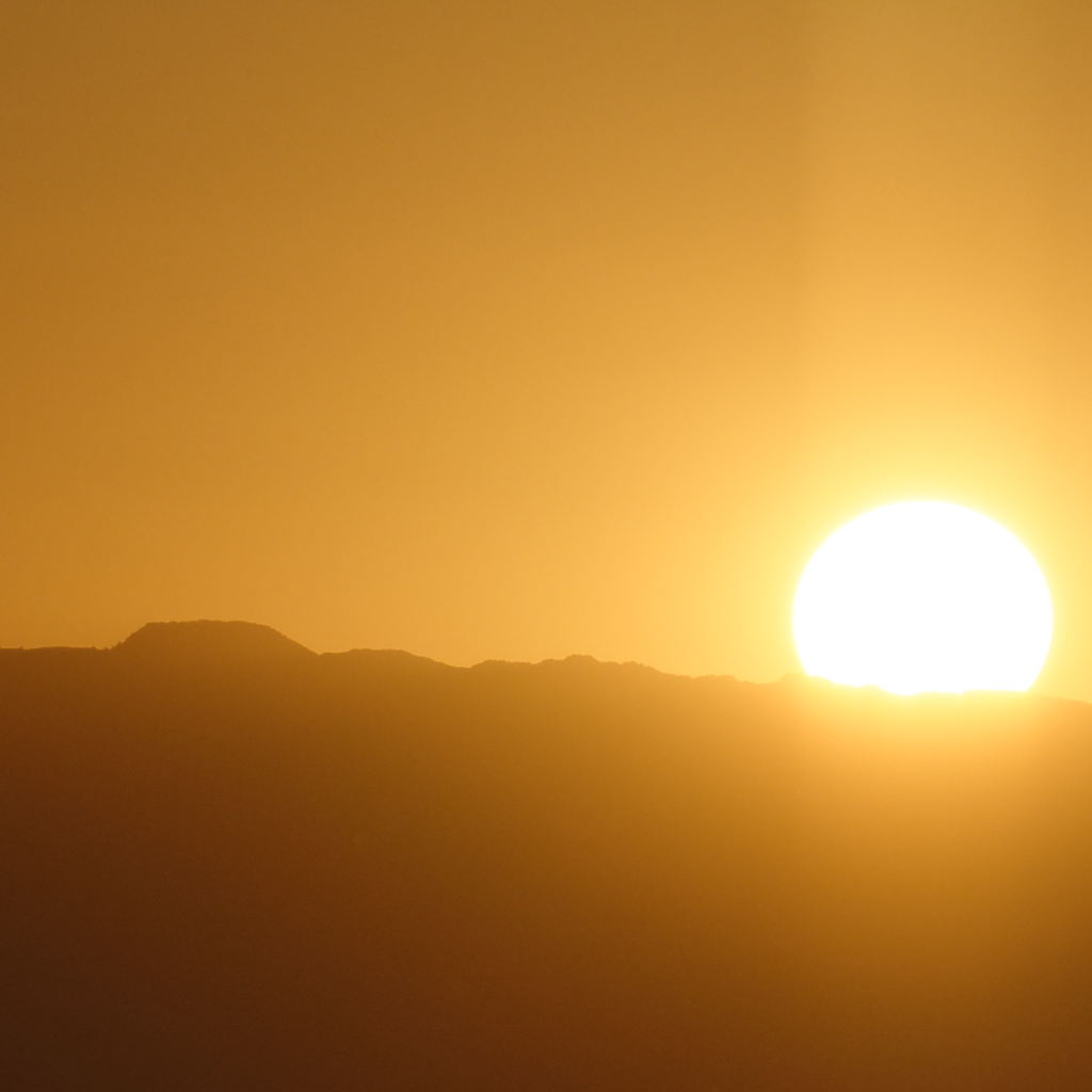
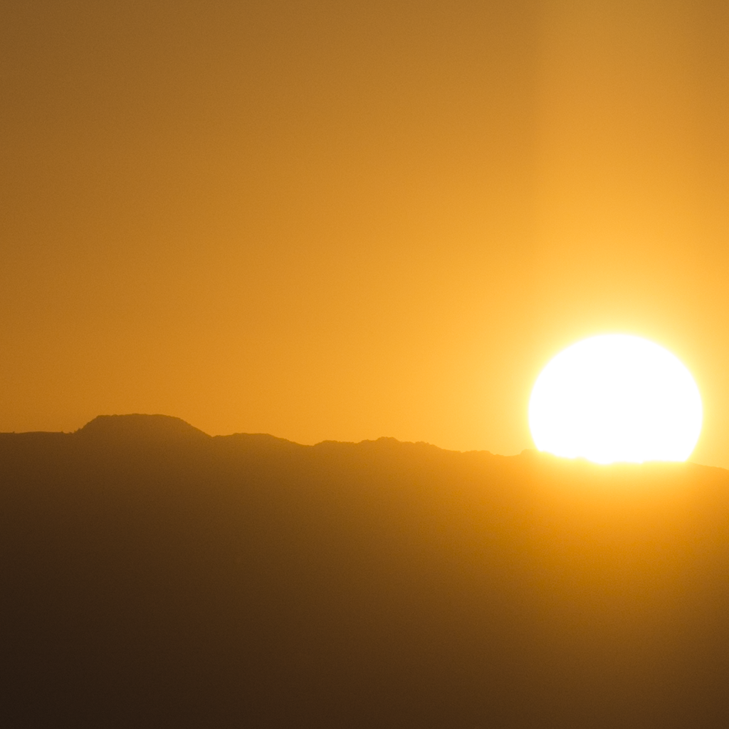
The Sunrise
This is a relatively specialised scenario – a pseudo ‘night’ scene but at base ISO – but I felt it worth including because, frankly, I’m frequently disappointed with sunset photos – both mine and those I see online. But particularly mine, which I’ve always suspected is Aperture’s fault…
And I think I might be onto something there. The first thing I notice is the big halo around the sun that only Aperture sees. Ugly.
DxO Optics has brought the shadows up noticeably – it shows that I was shooting this down the length of a valley, for example, with trees & rocks on the side. Consequently there’s a bit less contrast in its rendition, and the sun’s glow seems to bleed over the silhouette more than in the others, though I wouldn’t characterise this is objectively good or bad – and to my taste, I’m indifferent.
Lightroom has also tried to bring up the shadows a bit, though not so strongly.
But truly the key aspect of this type of photo is colour. And that’s also the most subjective. I can’t even decide which of the four I prefer in this respect. It’s certainly true that DxO Optics’ is the warmest rendition, and Capture One’s the coolest. If I were forced to choose I’d probably favour Aperture or Lightroom’s colour.
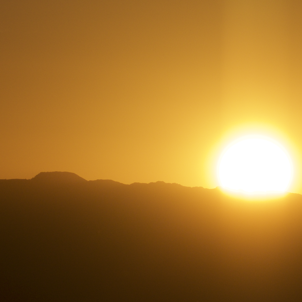
Looking closer just emphasises Aperture’s terrible work. And it’s noisy. In an ISO 100 photo.
In fact noise is visible in all four photos, despite this being at base ISO. Disappointing. Presumably this is actual sensor noise from the camera – no camera is perfect in this respect, even at base ISO – though given the nature of this photo, noise reduction could be applied very aggressively without detriment.
There’s also banding visible in all four photos. Aperture’s rendition appears to have the least offensive banding, surprisingly, though it’s quite possible it’s just most obscured by the higher noise. DxO Optics has done the best job in the sky, though perhaps not as good as Capture One in the silhouette, where DxO Optics’ characteristic blotchy noise rendering stands out more.
DxO Optics has done the best with the high contrast edge of the sun, though. Aperture’s rendition of this is awful, as previously noted, and even Capture One & Lightroom struggle a bit with it, adding an extra halo around the edge. Of those two, Lightroom’s is least offensive at it’s at least pretty smoothly graduated, while Capture One’s has some slight banding.
Judgement
This is perhaps why I dislike sunrise & sunset photos so much – nobody can render them well, to my eye. It’s difficult to pick a favourite from these four… but, I do find myself dislike DxO Optics’ version the least.
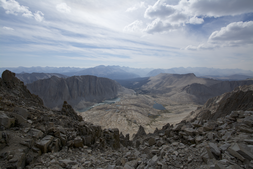
The Valley
A slightly higher quality landscape photo, than the touristy happy-snap style represented previously. This one’s exposed correctly, has a decent subject and framing, and is at base ISO with a high shutter speed, so detail should be good, but possibly hampered by the great subject distance.
Not a big difference between the four. DxO Optics’ rendition stands out the most, as being brighter overall – mainly due to it lifting the shadows most. It’s also done a good job with overall contrast – producing properly white clouds without losing any detail, and presenting pleasing global contrast despite the lifted shadows. It also has notably more detail than the others’.
Capture One’s rendition has stronger colours, though you’d be forgiven for not noticing immediately. If you compare it closely with Aperture’s, though, it makes Aperture’s rendition look a bit gloomy.
DxO Optics has also corrected for geometric distortion in the lens, though again the effect is subtle and might be missed, and doesn’t really affect the photo’s aesthetics.
Lightroom’s rendition is the flattest, and least pleasing to my eye. Though Aperture’s slightly under-exposed rendition is a bit dark and unattractive too.
DxO Optics has brought out the most fine detail, though in doing so it’s produced an over-processed appearance. Capture One does a better job of bringing out detail which, while not quite as crisp, is much more natural looking. In any case, the difference between them appears to be just the strength of their sharpening – actual level of detail is the same.
DxO Optics’ rendition of the slightly out-of-focus foreground rocks is quite good, however. The extra contrast it’s applied has benefited it significantly, in addition to the stronger sharpening working well in this case.
Aperture & Lightroom, as per usual, bring out significantly less detail, though in this particular case Lightroom has done a better job than Aperture. In the face of the Capture One & DxO Optics versions, though, you might not notice the difference.
Judgement
Capture One wins this round. It has nice colour, and relatively pleasingly-rendered fine detail.
DxO Optics comes in a not-distant second with nicely lifted shadows and good detail, albeit at the expense of appearing over-sharpened when you look too close.
Aperture and Lightroom share last place. Aperture has a nicer rendition w.r.t. contrast if not colour too, but Lightroom has brought out slightly more detail.
Methodology
The basic process was:
- For each contender:
- Import the original ten NEFs into it.
- Tell it to export the ‘processed’ versions by whatever process each app has (e.g. in Aperture it’s “Export Versions…”, in Capture One it’s “Process”, etc). Export as an 8-bit TIFF in AdobeRGB (1998) colour space.
- Run a simple batch process in Photoshop or GraphicConverter to open each TIFF, scale it to 1024 on its longest side, and then save as an 8-bit TIFF again.
- For each image, identify an appropriate 1024×1024 crop and use GraphicConverter’s batch processing capabilities to open each of the original TIFFs, crop to that area, and then save again as a TIFF.
- Run another batch process in GraphicConverter to combine each set of four 1024×1024 TIFFs (both sets – the scaled down and the cropped versions) into a single TIFF, for the 2 x 2 or “four-up” views.
- Batch convert all those TIFFs into JPEG2000 format (lossless) for web display.
Note: many years later, in 2023, I replaced the images on this page with WebP versions (also lossless). This increased their size slightly (WebP isn’t as efficient as JPEG2000) but meant that virtually all modern browsers can show the images, rather than basically just Safari. - Run a full calibration using a ColorMunki Display (with default settings).
- Compare all those JPEG2000s or TIFFs on a 27″ 2011 iMac.
And that’s it. Pretty simple, but time consuming for the various stages of conversion.
I started doing the batch processing with Photoshop, but it was glacially slow and difficult to use, so I switched to GraphicConverter midway through. File sizes and metadata might differ, but there should be no difference in the actual visual results as both have proper colour profile support (with no conversions being performed) and the image formats in question are all lossless.
Why look at only a 1024 x 1024 section for 100% viewing?
Because I didn’t want to have to scrutinise each photo so intently – as it was I spent hours comparing the final results, in order to make my notes & judgements.
Why AdobeRGB (1998)?
It’s the colour space I work in and export my images in. Even amongst those that export in sRGB or similar, more limited colour spaces, most are working in AdobeRGB during editing (whether they realise it or not).
I briefly considered other options, like ProPhoto RGB, but aside from the fact that I use AdobeRGB today, with no plans to change, AdobeRGB (1998) appears to be the highest common standard amongst these four contenders. And I strongly wished to avoid using an external converter, as that introduces room for favouritism (colour space conversion is surprisingly complicated, and conversions from different origin spaces to the same destination might introduce unintended differences). It’s also unrealistic, as I expect the vast majority of people don’t perform an external colour conversion or adjustment step.
Why not use DxO Optics’ “PRIME” noise reduction?
Three reasons:
- It’s not enabled by default, and is virtually impossible to adjust using only the tiny little preview window they give you.
- It takes a really long time to render the output images. This compounds the only workaround available to problem #1, above, which is to actually export the image over and over again in order to narrow in on decent settings.
- Frankly, in the brief tests I’ve run, it doesn’t actually perform better than the default noise reduction algorithm in DxO Optics. In fact, for one of my images it did noticeably worse – removing no more noise but killing significant detail.
Why not turn off DxO Optics’ geometric distortion correction?
Because it’s on by default. The same question could be asked of any and all the other options each contender offers. Granted the distortion correction seemed to have a relatively pronounced effect on DxO Optics’ output, but that’s what it feels is the best trade-off, clearly, and some people may find it a valuable feature, so I don’t want to discount it.
Why an old iMac?
Because Apple haven’t released a newer model compelling enough for me to upgrade.
I would have preferred to perform the test on a ‘Retina’ display, but I had to work with what I have. I do intend to revisit the images on some other devices – including mobile devices like an iPad – to see if there’s a meaningful difference in appearance.
Why lossless compression?
The files are quite big, despite being compressed with WebP, the most efficient lossless format broadly available across browsers in 2023. They could be made much smaller with lossy compression, but then you wouldn’t know how much of what you’re seeing is the actual raw converter’s doing and how much is compression artefacts.
Why WebP?
I also tested JPEG2000, AVIF, PNG, and TIFF – and originally offered versions in all of these except AVIF, for browser compatibility purposes.
JPEG2000 compresses best – slightly but consistently better than the next best, WebP – but is basically only supported in Safari.
AVIF surprisingly performs universally worse than WebP and JPEG2000 for lossless compression (it tends to do better for lossy compression).
PNG was a pretty distant 4th place, followed by an even more distant TIFF in last. This is expected – PNG is pretty good for low detail images, especially artificial things like screenshots or simple digital drawings, but quite bad for everything else. TIFF is barely compressed at all (arguably part of its nature as a format which prioritises ease & speed of local use on computers that are presumed to have fast storage and lots of RAM).
I switched to WebP and deleted all the others, in 2023, in order to save space – all those lossless-quality files in the varied formats were taking up gigabytes of space on my web server!






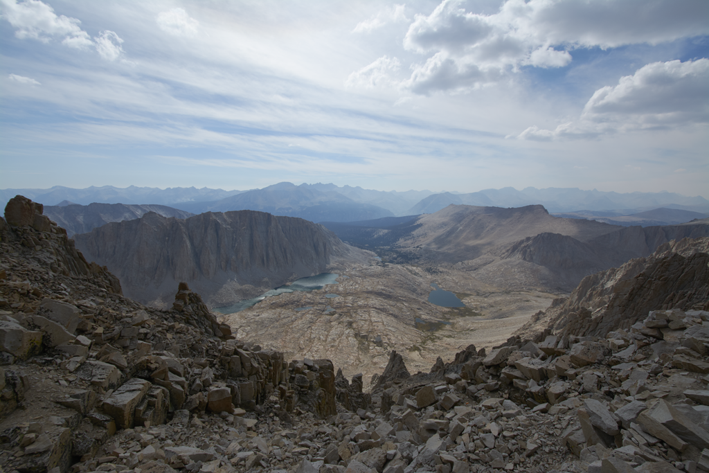
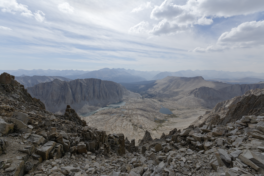
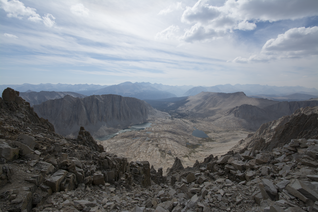
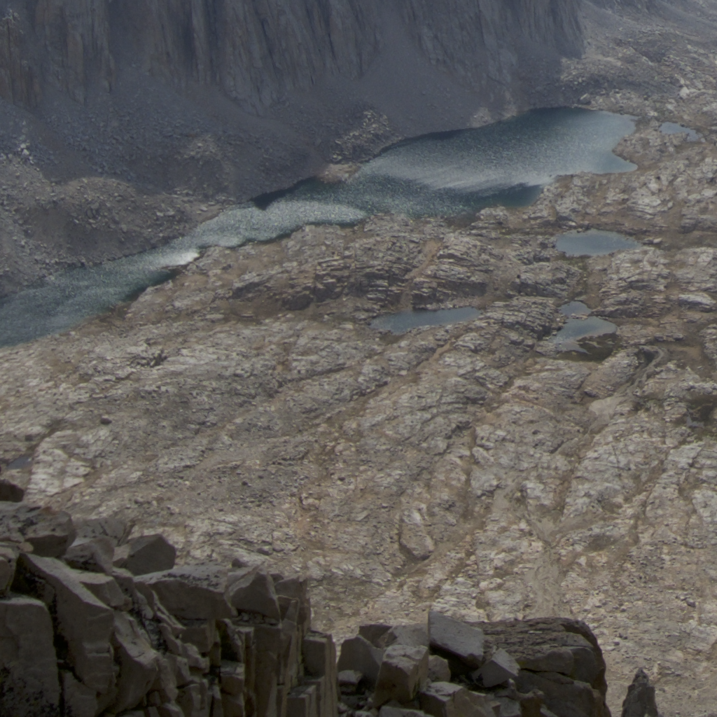

“robgendreau” in DPReview’s forums pointed me towards another, very detailed & expansive analysis done by Nik Jewell, at https://web.archive.org/web/20160119153632/https://www.nomadlens.com/raw-converters-comparison. Well worth the read. It’s interesting that, despite taking a very different methodology – of comparing like and/or best results of editing in each app – Nik arrived at basically the same ranking that I did here.