
Contents
I’ll cut to the chase: it’s a nice resolution upgrade from an Apple or LG 5k display. But that’s about it – in every other visual respect (brightness, contrast, etc) it’s basically the same or marginally worse (see Matte-ugly). Though the built-in KVM is a nice addition.
Resolution
The extra resolution is significant – it is 38% more pixels – and welcome, but it’s not revolutionary. It feels like what should have just been the natural progression and not a big deal – in the same way we started with 9″ sub-VGA displays and have over decades worked our way up to bigger and higher-resolution ones.
And in that vein, the prospect of downgrading back to a 5k display is immediately deeply unappealing (pay attention, Apple 😠). The notion of going down to a mere 4k display is absurd (tempting as bright[er] OLEDs are1).
Dimness (née Brightness)
Even though it’s supposedly brighter than the LG UltraFine 5K it’s replacing for me – at least at peak, given its DisplayHDR 600 rating – it really isn’t. For everyday work (coding etc) I had the LG set at 50% brightness (so nominally 250 nits, given its 500 peak rating) but the equivalent brightness requires ~75% on the Asus. Which actually fits if you take the Asus’s manual (not its tech specs) at its word of a 350 nominal max brightness, since 250 nits is roughly 75% of 350.
So that’s disappointing. The LG UltraFine 5K was sort of bright for its day, but that day was nearly a decade ago. We now have cheap laptops with 1000-nit displays, so 500 is unequivocally dim now.
Not that I expected much else – while Asus can’t seem to agree with themselves over the actual peak brightness, they never claim more than 400, so going in I suspected it would be dim. What I didn’t expect was that the claims of multiple reviewers, that it’s actually closer to 700, would turn out to be completely false.
The one thing that makes a difference in practice, in the Asus’s favour over some older displays like the LG, is that it supports HDR mode. So you can in practice get noticeably higher brightness in image & video editing without having to blind yourself2.
Matte-ugly
I do not like the matte finish. Compared to the LG UltraFine 5K that I was previously using, the PA32QCV has lower overall contrast (it’s more washed-out looking), and visible ‘shimmer’ or ‘sparkle’ – basically fine luminance noise that changes as your viewing position changes (even just slightly). It makes the screen look a bit dirty, too.
In a nutshell, contrast is lower than it should be, and text just doesn’t have quite the same clarity it does on other displays (like Apple’s, or the LG UltraFine 5k).
I’ve not yet decided if it’s a deal-breaker… there’s no good glossy 6k display options currently. I’m hoping that I’ll just get used to it. But there’s no mistaking that the screen’s finish is notably worse than its predecessors and Apple contemporaries. Especially for bright content (folks using Dark Mode might not be affected so much).
A little digression: I still [vaguely] remember when Apple introduced the first glossy screens (as an option, not the default) in 2006, and then the storm in a teacup when they made glossy the default (but matte still an option) in 2008 MacBooks (and glossy the only option for the 2008 Cinema Displays). Back then, I was against the glossy displays – not zealously, but I didn’t understand why you’d want a display that was basically the same except for the notable addition of annoying reflections.
In retrospect, I think the key difference was Retina. When your pixels are the size of boulders (pre-Retina), a bit of blurring or fine-resolution grain is largely irrelevant because it’s so small compared to the pixels themselves. Indeed, I can’t find any mention of sparkling or blur in contemporary writings of that time – all the discussion centres foremost on reflections and (sometimes) the possibility of higher macro-contrast (deeper blacks, primarily).
But when your pixels are also small – approaching the size of the speckling – suddenly it matters, because an entire pixel can be obscured or corrupted by the matte finish’s “sparkles” or blur. Your eyes (or brain) can no longer apply an optical “low pass filter” to ignore the matte’s effects.
On the ‘upside’, as I age my eyes continue to degrade, so eventually I’ll no longer be able to see the sparkles. 😆😐😞
VESA mounting
I was perplexed when I first opened the box, and found what looked like a proprietary mounting system, with only a stand included, not a VESA mount adapter. The box contains basically no instructions or explanation of anything, and even the manual – dug up through manualslib online because Asus’s website contains only broken links to it (though I later noticed that B&H host it too) – has no real information on how to VESA mount the display, other than cryptically stating that you need a “VESA Wall Mount Adapter (sold separately)”.
Thankfully, Itchy_Pin9813 on Reddit had already figured it out – the four screws that look like they might be structural, are actually just weird placeholders.
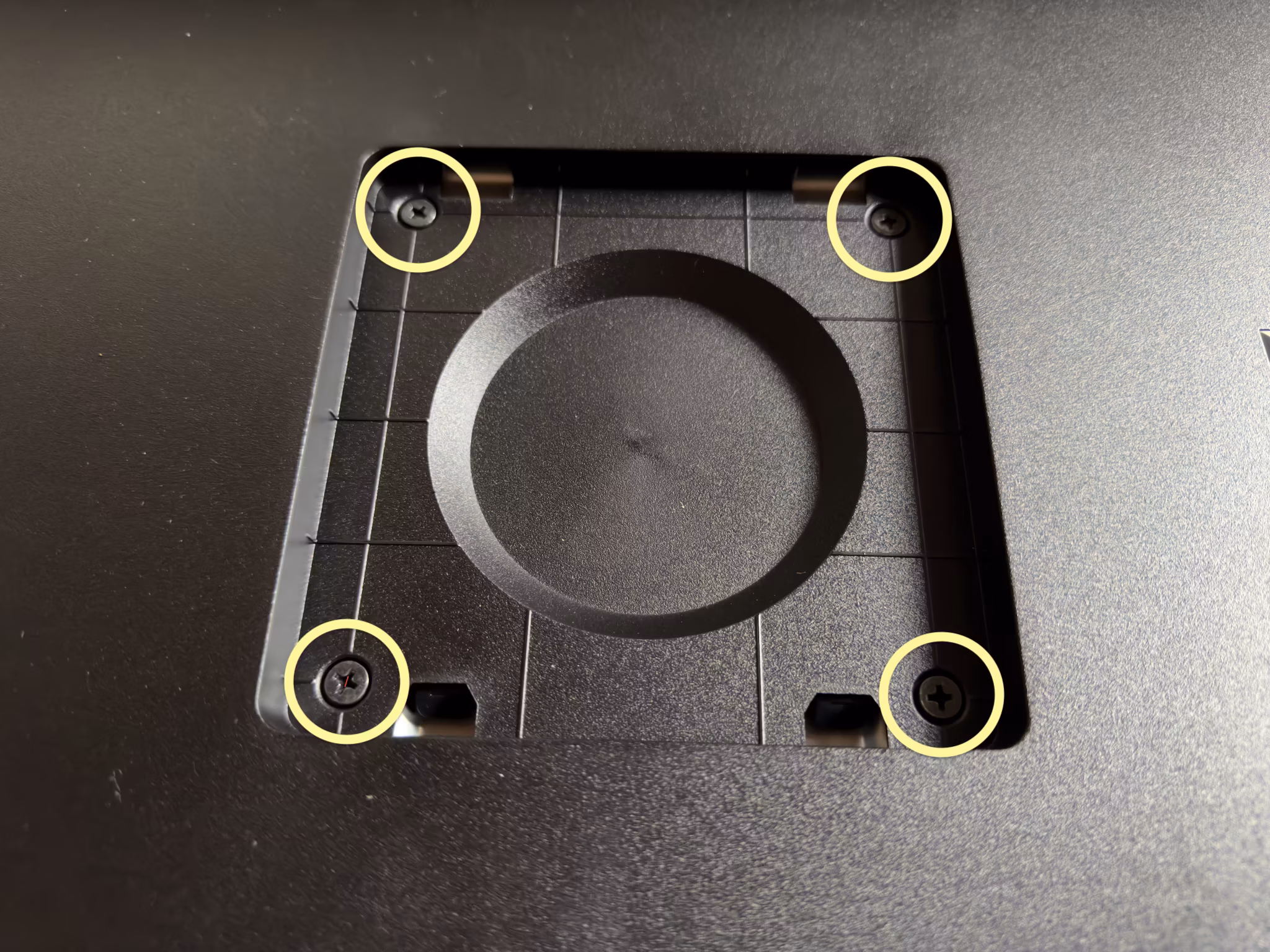
You just remove them and then screw in any standard 100⨉100 VESA mount.
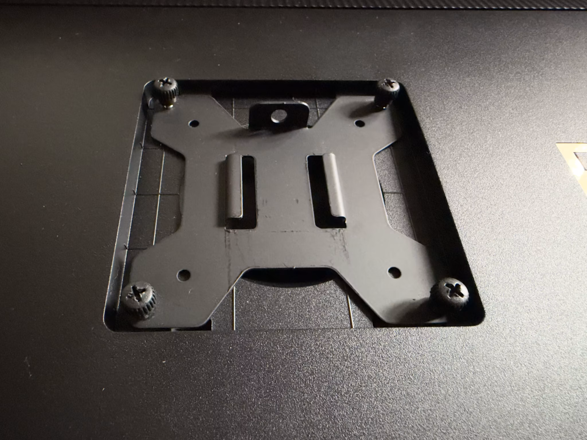
However, be aware that the mounting point is recessed significantly. Though the plate itself fit in the recessed area just fine (as shown above), I was only barely able to get my mount plate attached to the arm itself, without the arm hitting the surrounding casing. I did notice that you can buy adapters specifically designed to address this design flaw.
BSOD
When the display detects no input video signal, it displays a hideously-coloured bright blue screen, reminiscent of Window’s Blue Screen of Death.
Which would be fine – generally you won’t see that, unless something’s genuinely gone wrong with your cables or computer – except that it sometimes flashes into this mode when your Mac goes to sleep or wakes the display back up. It’s jarring and ugly.
This isn’t the first display to have this design flaw, but I just cannot fathom how, after decades of experience in displays all around us in the real world, someone somewhere inside Asus still thought it’d be a good idea to do this instead of just displaying a black screen (optionally with calm grey “No Input Signal” text on it).
KVM
Having a built-in KVM should be nice – I have my personal Mac and [sometimes] my work laptop connected, and previously I was manually moving the Thunderbolt cable between them (like a cave man! 😜). Which wasn’t a big deal per se, but I do worry about frequently plugging and unplugging a Thunderbolt cable – those USB-C style connectors aren’t infinitely durable. And Thunderbolt is a pretty demanding protocol, that I suspect doesn’t tolerate electrical flaws well. And quality Thunderbolt replacement cables aren’t cheap.
So, KVM, great!
Except… the implementation in the Asus is pretty clunky. There’s a dedicated “Input Source Switch” button right on the front panel, which should be perfect – except it often doesn’t work. If your Mac(s) are set to turn the display off after some period of idleness, they’ll stop sending a video signal to the display, and the display then considers them non-existent. So the “Input Source Switch” button only ever works in the brief period after a previous switch, when the prior Mac is still sending a video signal to the display.
Disabling display auto-off on all your computers is one option, but not a great one – sometimes I’m called away abruptly, potentially for many hours, and I don’t want the display sitting there wasting power and burning itself in. A screen saver might help with the burn-in aspect, at least, but not the power (and keep in mind this display is rated to about 50W (not counting USB & Thunderbolt power), which is too much to waste).
If you have your keyboard & mouse connected through the display – in order to make intended use of the KVM functionality – then you also run into the problem that if the Mac has gone into screen off mode, the Asus display turns off all the USB devices too. So you can’t wake your Mac from the keyboard or mouse. Nor switch input sources.
So, I’m having to resort to hitting the power button on my Mac Studio, and opening my laptop on the MacBook Pro, in order to wake them up. Or, I discovered that you can ‘force’ switch input sources – which will wake the connected Mac – through the display’s on-screen display. But that’s quite a few clicks and nudges of its joystick – and only makes it more baffling and frustrating that the dedicated “Input Source Switch” button doesn’t just work.
I wish there were a configuration option to (a) never power down the USB devices and (b) just tell the display that some inputs (Thunderbolt, Display Port, and/or HDMI) are always connected, whether it’s receiving a video signal currently or not. Clearly the display can wake up connected Macs – it does so when you select their input source deep in its settings.
Picture-in-Picture (PIP) / Picture-beside-Picture (PBP)
I’m not sure if I’d ultimately use these – I hate the PIP “feature” of YouTube and some Apple apps, for example, and don’t want to mess with display resolution and aspect ratios for any of my connected computers – but it turns out I can’t, anyway.
The caveats are buried deep in the manual:
To active this function [PIP / PBP], you need to do the following: turn off MediaSync / Dynamic Dimming and disable HDR on your device.
I don’t want MediaSync or Dynamic Dimming anyway (see the Configuration recommendations section below for why), but I do want HDR mode enabled. Having to disable HDR mode is far too great a sacrifice, for a feature that’s arguably just a gimmick anyway.
10-bit colour lies
The Asus (like most displays these days) is marketed as having 10-bit colour.
But it doesn’t.
The lie is revealed only in the back pages of the user manual (the one that doesn’t come with it in the box, nor is accessible from Asus’s website). This display, like so many others, is actually an 8-bit panel that uses FRC (Frame Rate Control) i.e. temporal dithering: the monitor accepts a 10-bit signal but can only set the actual pixels to 8-bit precision, so it oscillates back and forth between adjacent 8-bit values in order to approximate the desired 10-bit value, over time.
I don’t actually know how much that matters – I can’t say I’ve had complaints about the LG UltraFine 5K w.r.t. banding or other 8-bit artefacts, and it was also an 8-bit display with FRC.
Still, I’m not happy with Asus basically lying in their marketing material – and tech specs, which are usually one place you can get to the truth.
Subtler effects
It might take more time to appreciate some of the more subtle differences, vs the LG UltraFine 5K at least.
HDR Mode
The ability to use HDR mode – meaning I can set my ‘regular’ GUI brightness to what’s comfortable without [artificially] limiting the brightness of imagery – might reveal itself as kind of a big deal, with further use, but since the additional brightness is pretty minor (in a daylight-lit room, at least) I don’t know yet.
Colour accuracy
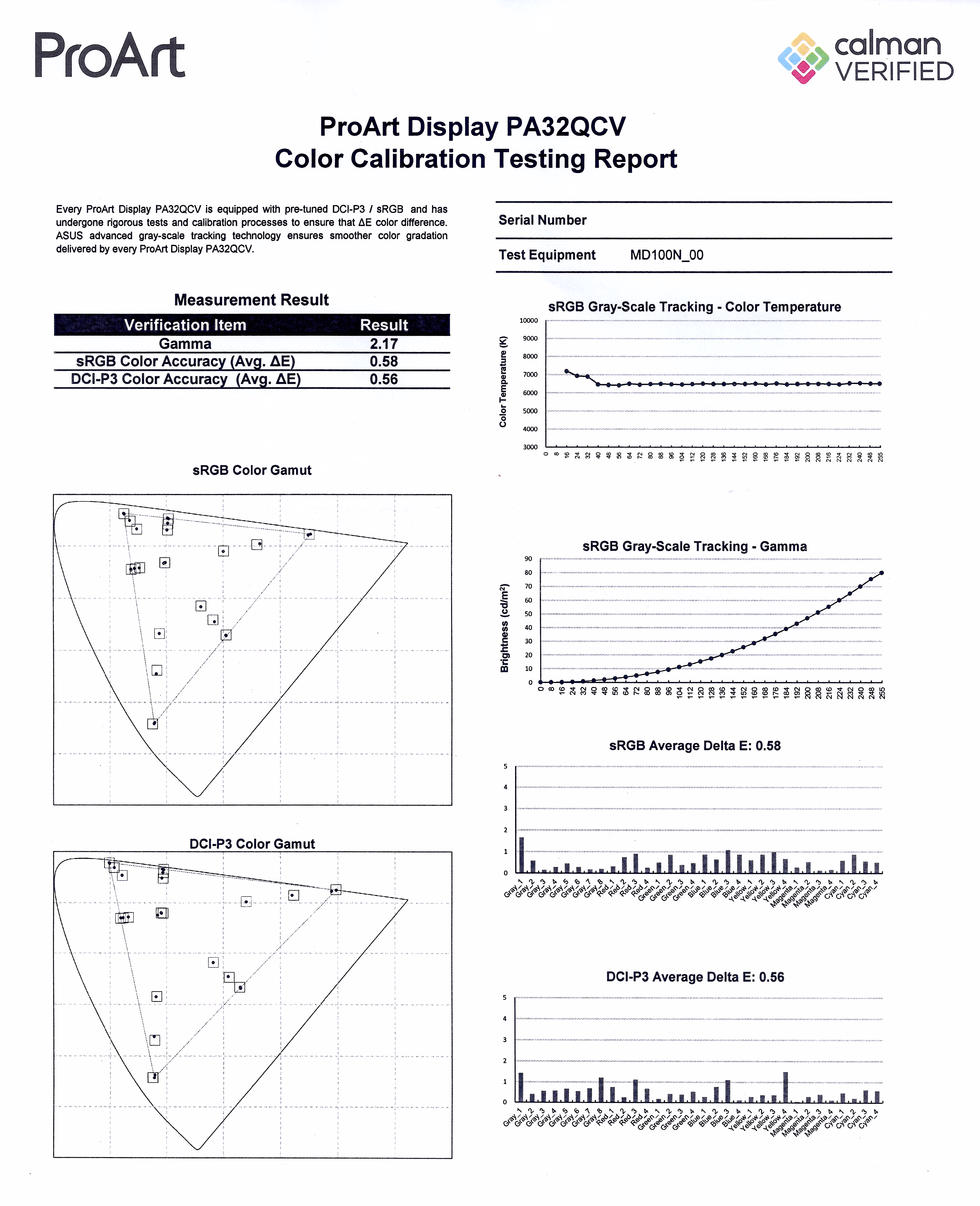
I also haven’t actually checked the colour accuracy yet. Asus do include a basic printed calibration report in the box, from their factory calibration, which is nice and hopefully not just performative. I do have a colour metre (an old ColorMunki), but going through the process is frankly frustrating and tedious, and I’m rarely actually happy with the results (more accurate is not the same as better looking). I can at least say that the colour looks fine (once I dialled in better settings than the defaults – see below) and similar-enough to the other displays in my life that I have no complaints.
Configuration recommendations
- In macOS Settings:
- Enable “High Dynamic Range” for the display (in the “Displays” pane). This does two things:
- It enables macOS brightness control – the brightness slider appears in System Settings, and the keyboard shortcuts to control brightness will then work.
Note that, conversely, it basically prevents you adjusting the display’s brightness from the display’s own controls (you become limited to “MAX” and 250). - It allows HDR content to use the full luminance range of the display irrespective of the brightness setting. i.e. you can adjust the “regular” brightness of the GUI independent of the HDR image & video brightness. Note, however, that there doesn’t seem to be a way to control the brightness of HDR content.
Keep in mind, though, that the PA32QCV is not a bright display. It’s rated to up to 600 nits, and even that’s probably only for small patches of highlights or for brief time periods, which is really quite low – it’s nothing like a “true” HDR display such as Apple’s MacBook Pro displays, Apple’s Pro Display XDR, or the Asus ProArt 8K, that have sustained maximum brightness of at least 1,000 nits (2⨉ brighter), and generally peak much higher. Even iPhones are brighter3 (and have much better dynamic range, being OLEDs).
- It enables macOS brightness control – the brightness slider appears in System Settings, and the keyboard shortcuts to control brightness will then work.
- Enable “High Dynamic Range” for the display (in the “Displays” pane). This does two things:
- In the display’s settings:
- Settings > Dynamic Dimming should be OFF. When it’s on the display adjusts the brightness over time in response to the image shown, but very slowly such that you can see it ramping up or down lazily after an average brightness change (no matter what you tweak its sub-settings to). It’s just horrible for video creation since it’s seriously messing with your luminance and animation. And I’m not even sure it’s a good idea when merely watching video, since the brightness transitions are noticeable and distracting.
If you never view animated content, then I suppose leaving it on could be beneficial since its purpose is ostensibly to give you greater static range – when the screen overall is dim, such as editing a dark photo, it will reduce the backlight in order to darken the blacks, while conversely in a bright image it’ll boost the backlight to give you maximum brightness (but at the expense of washing out the blacks completely).
But, it really doesn’t do much. Yes, I can see the effect – it does make the blacks a little bit darker when the image is overall quite dark – but it’s very subtle and not remotely worth the visual artefacts it introduces. - Palette > Brightness must be set to “MAX” when macOS is using HDR mode, otherwise you’ll be limited to 250 nits even for HDR content! If macOS is not set to HDR mode then it sets the brightness in nits, from 0 to 400.
It’s pleasing to see a scale that’s in real units, not just some arbitrary scale like 0 to 100%. Or at least, I’m assuming that’s the case – that the scale goes to 400, and otherwise odd, arbitrary number, and that the display’s nominal peak [SDR] brightness is 4004 seems like an unlikely coincidence. - Palette > Black Level > Signal should be left at its default, 50. Changing this basically changes the luminance curve of the display – lowering it pulls down the brightness, crushing the shadows in particular, while raising it increases the brightness, washing out the shadows. It has no apparent effect on actual black levels (nor, surprisingly, does its peer “Backlight” setting, which seems strange because surely that’s the point of it?).
- If you’re creating HDR content, in the display’s settings, set Preset > HDR to “PQ Clip”.
If you’re viewing HDR content, use “PQ Optimized”.
Yes, this might be something you have to change frequently, because there’s no happy medium. 😔
Under the default setting, “PQ Optimized”, the display futzes with the image to make the display’s brightness limit less noticeable – it “smoothes” out the approach to the maximum brightness by making the too-bright parts darker (to prevent clipping) and the nearly-too-bright parts brighter. This provides a pleasing but highly inaccurate effect – you don’t see stark clipping as easily, and the image overall looks bright, but you’re seriously changing the localised luminance of the image. If you edit a photo or video this way and then put it on another display, you may be dismayed to find it looks completely different, luminance- and contrast-wise.
This is a consequence, I infer, of how macOS renders HDR content. In SDR mode, macOS just directly maps the input image’s dynamic range to the display’s – 100% in the image goes to the display as 100%. But in HDR mode it seems like it’s basically ignoring your display’s capabilities and working in absolute brightness. So if the input image says it is 2,000 nits, macOS emits pixels with that nominal brightness. Which may be way beyond what the display can handle, so they just get clipped to its max brightness (or artificially adjusted by the display – as in “PQ Optimized” and “PQ Basic” modes).
And (for completeness) the “PQ Basic” setting is, I think, doing just the darkening part of “PQ Optimized”, which in a nutshell means it looks like “PQ Optimized” but dimmer overall. I’m not sure what use that is. - Settings > PowerSaving can be set to “Deep Level” (the default, for “Energy Saver” mode) iff you have macOS set to HDR mode. Otherwise, it limits the maximum brightness severely.
Of course, I’m not yet sure what “Deep Level” does in HDR mode – possibly nothing. But I’m hoping it just means the display uses less power when not actually active.
- Settings > Dynamic Dimming should be OFF. When it’s on the display adjusts the brightness over time in response to the image shown, but very slowly such that you can see it ramping up or down lazily after an average brightness change (no matter what you tweak its sub-settings to). It’s just horrible for video creation since it’s seriously messing with your luminance and animation. And I’m not even sure it’s a good idea when merely watching video, since the brightness transitions are noticeable and distracting.
- This ties into my choice to get this 6k display, here and now. I agonised over the decision for a long time. I was pretty much resigned to just paying some obscene amount of money for the Apple Pro Display XDR 2 – on the assumption that it’d be a nice modest upgrade with more backlight zones and a brightness boost, which turned out to be correct but alas not the whole story – but once Apple publicised that they were killing the XDR entirely, it left me in the doldrums.
I considered many options – including buying no-name-brand ones from China – but ultimately whittled it down to two possibilities: the Asus ProArt 8K, or the 6K. The Asus ProArt 8K is Apple-level expensive, and at 32″ its pixel density is far too high to actually reap noticeable benefit from the extra pixels over the 6K, but it otherwise checks the boxes. I spent a long time trying to convince myself it wasn’t insane to spend $9,000 on a display – keeping in mind that the original Apple Cinema Display was $4k at time of release in 1999, which is nearly $8k in 2026 dollars, and the Sony Trinitron displays were thousands of dollars too, in the 1990s… I also tried to reason that a display should last basically forever, and remain useful for decades, so what’s $9k over the rest of my life? 😅
But in the end I thought… why? Even that $9k 8K display isn’t the best at everything. It’s not the brightest, it doesn’t have the biggest colour gamut, it doesn’t have the best contrast ratio – it’s not even the prettiest… if I’m going to spend eye-watering amounts of money, I want to at least feel like it’s worth it.
So, I went with the cheapest option instead, on the assumption that I’ll revisit my display situation in a few more years. ↩︎ - On “non-HDR” displays – specifically, where macOS doesn’t let you use the “HDR” option in the display settings – your images & video can only be displayed as bright as the current brightness setting – which is typically not the maximum brightness the display can manage, because if you raise the display to maximum brightness in order to get the full dynamic range available, then all your regular windows – white-backed webpages, TextEdit & Xcode documents, etc – become blindingly bright. ↩︎
- Well, maybe… the iPhone 17 Pro might be rated at [up to] 3,000 nits, but in reality it can’t even handle the display being on at all sometimes, such as if exposed to sunlight. I have a torch (flashlight, Americans), a Google Firesword, that’s spec’d as 3,000 lumens – just 875 nits – and it’s way brighter than the iPhone screen ever is. Way brighter.
Yes, there’s a significant difference in emitter area between a torch and an iPhone’s display, but even just considering how much it lightens the room it’s in, the Firesword easily wins against any iPhone. And any display I’ve owned. ↩︎ - Well, maybe. As noted, while the tech specs claim 400, the manual says 350, and it’s my guess – based on comparison with other displays and referencing their rated peak brightnesses the the truth is much closer to 350 than 400. ↩︎
